Understand the Marketing Impact of Color To Increase Productivity
Dentists that ask what the best color scheme for a dental office is will typically have a hard time finding answers because the truth is a color is a place of unlimited possibilities. Color selection is not a straight guide because many factors come into play with colors. Here’s the funny part about dentistry;. At the same time, universities aim to teach new and budding dentists the basic fundamentals of medical practice, marketing your expertise and services out to the world is an entirely unique aspect of business all on its own. With marketing, it’s about building an atmosphere with the colors and designs you choose, and to make the right color choices for your business; you’ll need to identify these objectives before choosing your palette.
Impact Objective – Identify the impact you wish to have on your patients because colors evoke reactions that reinforce the image of your business. Ask yourself what kind of adjectives you want your practice to be seen. For instance, if you wish for colors to evoke peaceful, relaxing colors, then cool-toned colors will effectively produce the emotions you want to desire in your patients.
Pro Tip: Depending on the type of dentistry you practice, you can search for colors that you believe will appeal to audiences. Pediatric dentists tend to work with bright colors to appeal to children. In contrast, cosmetic dentists prefer to choose luxurious colors, such as black and gold, to attract patients in need of cosmetic services.
Personal Preferences – Keep in mind that although the standard issue for most medical practices uses colors such as dark blue and red, it doesn’t mean you have to conform to those standards. While blue is seen as the most reliable color, color choice is personal, as your practice should reflect your personal preferences and sense of style. For example, if you find you prefer yellow, then choose it!
Color Theory – However, choosing the colors you like doesn’t mean they’ll look good in an office setting, and that’s where color theory comes in. The color theory focuses on the meanings behind the colors and their relationships on the color wheel. The color wheel shows colors that harmonize with one another, and by learning about the different combinations, you can choose a palette that suits your personality and professional space. Some combinations include:
- Complementary – Colors opposite on the color wheel that have high contrast and impact, such as blue and orange.
- Monochromatic – Three shades based on one color, such as different shades of green, to project a harmonious look.
- Analogous – To create a versatile palette, there are three colors alongside the color wheel, such as dark blue, medium blue, and light blue.
- Triadic – Three colors evenly spaced along with the color wheel for high contrast, such as red, blue, and green.
- Tetradic – The tetradic color scheme is similar to triadic, but with four colors instead of three. For these, it’s best to choose one color as a dominant color and others as an accent.
The color theory also has a psychological element to it, meaning that the colors you choose will impact the environment around you. For many offices, these four colors have the top psychological impact on productivity.
- Green – promotes harmony/balance, reduces anxiety, reduces eye-straining.
- Blue – soothes/calms, promotes trust and communication, and improves focus.
- Yellow – creates optimism and promotes focus and innovation.
- Red – boosts heart rate and blood flow and increases brain activity.
Best Examples of Color Palletts for Dental Offices and Websites
Selecting Colors For Your Dental Website
1. Color Palette #1 – Summer Splash
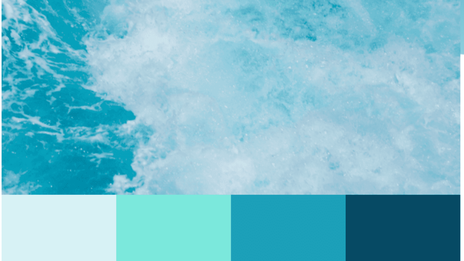
Summer splash, consisting of a monochromatic color scheme of blue, is a classy, reliable choice in design due to its calming, soothing effects. Throughout this color scheme, navy blue acts as the neutral component, as it is reminiscent of the deep blue ocean and space. When combined with both blue grotto and blue-green, these two colors act as the bright, energizing element that attracts the viewer’s eye toward all adjacent colors. These colors create a sense of harmony and relaxation, and using baby blue as a lighter accent creates a sophisticated palette that’s fresh, traditional, and easily recognizable by any patient.
More Information
2. Color Palette #2 – Sea Tide Tan
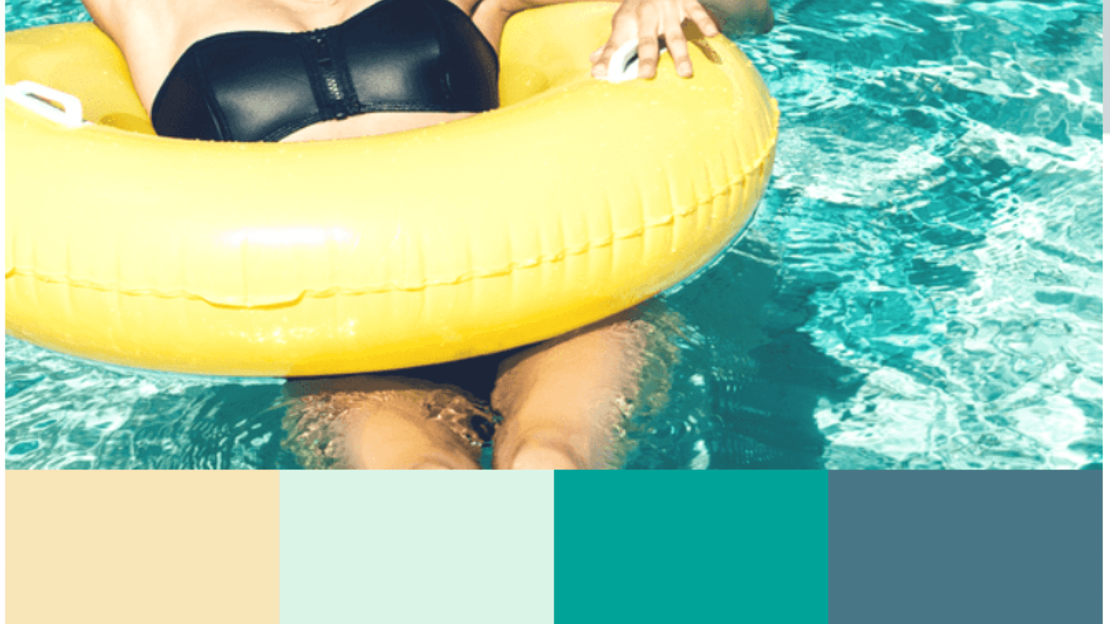
Sea Tide Tan plays with analogous green shades and adds an adjacent shade of yellow/tan to form a sense of harmony and focus. Its darkest shade, a misty blue with green undertones, has soothing and calming effects and acts as the primary neutral shade to offset the brightness of the teal green and mint. Teal green works to bring freshness and convey a sense of clarity and serenity throughout your office. Mint, because of its common associations with dentistry, works to create a crisp, clean impression, and the champagne adds a lighter, neutral tone that evokes subtle energy and warmth.
More Information
3. Color Palette #3 – Cheery Cake Pops
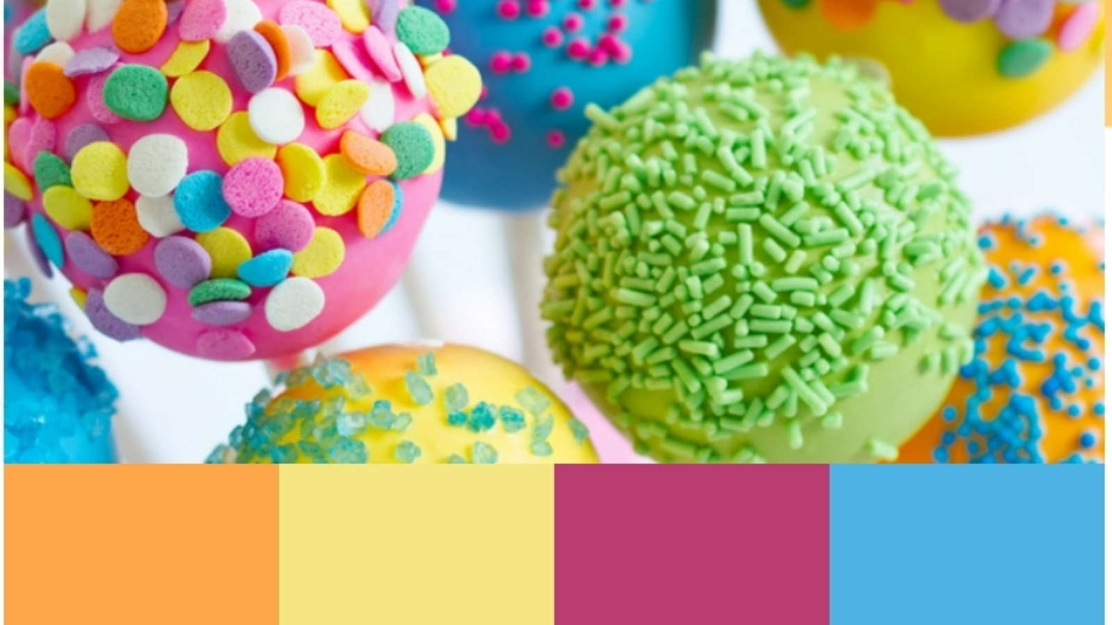
Cheery Cake Pops takes on a brighter, playful aesthetic, attracting the eye towards dazzling, intense hues to create an exuberant tetradic scheme. As an excellent choice for pediatric dentists, each of the colors radiates warm and cool tones that provide an even amount of complement and contrast, adding variety and diversity. Its warm tones, orange and mimosa yellow, bring youth, energy, and vitality that’s stimulating to the imagination. Its cooler tones, teal blue, and deep fuschia, both offer uplifting, renewing qualities that help to calm the warm properties of the orange and yellow while also providing clarity and assurance to the overall palette. These colors would be best used as accents due to their vivid hues and can work best with neutral whites and grays.
More Information
4. Color Palette #4 – Cheerful Sands

Cheerful sands work with a highly popular complementary scheme of orange and blue but add brightness and intensity to create a brilliant, keen, inviting fresh color scheme. With mimosa orange and bright turquoise acting as the primary colors, these opposing colors create a sense of both tranquility and stimulation, keeping the active viewer engaged and interested. This palette is bold and modern, with yellow and cyan acting as accent colors. It embodies optimism and playfulness while also retaining a sense of refined control in its color relationships.
More Information
5. Color Palette #5 – Sandy Beach Path
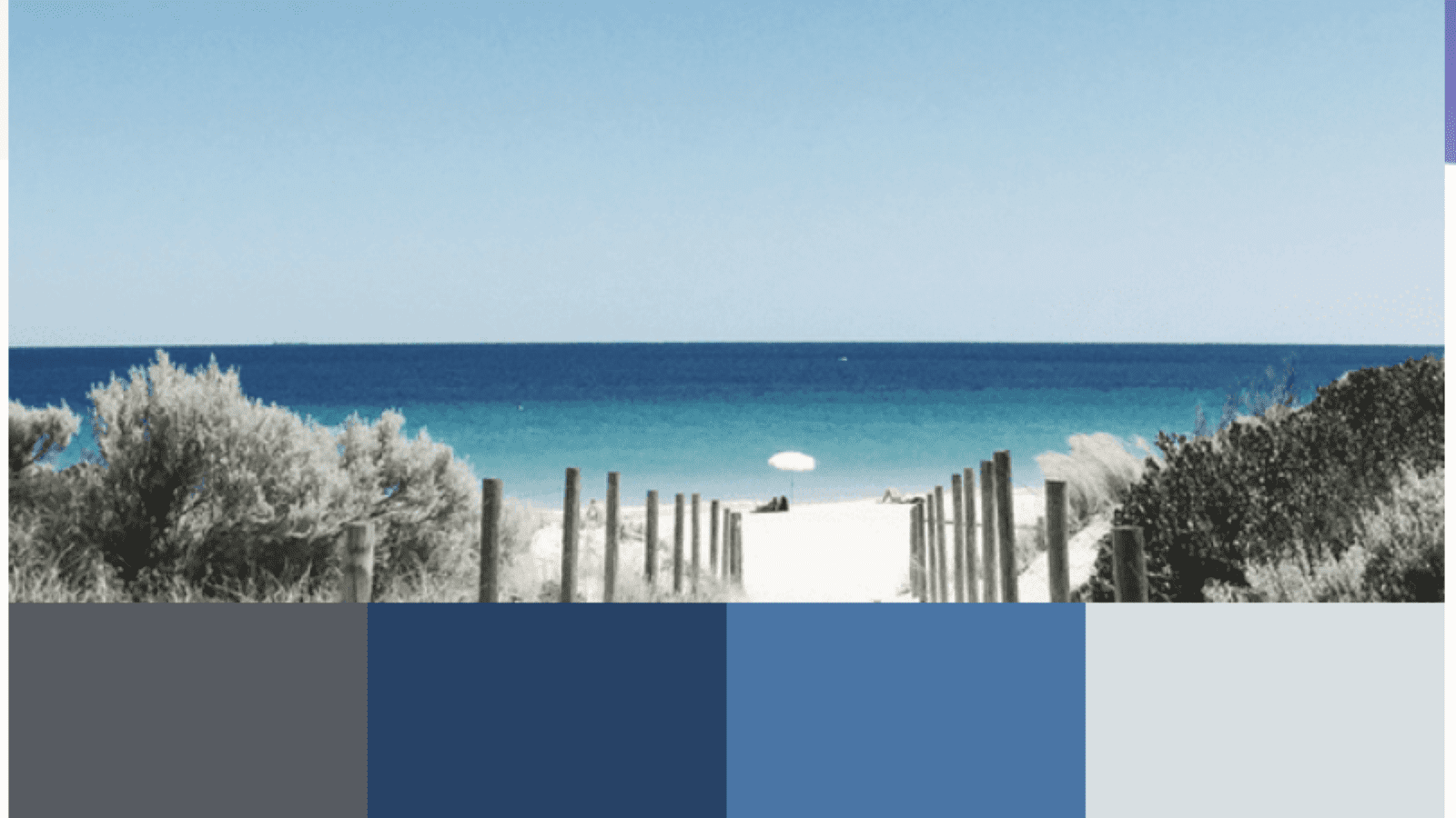
As a dependable, grounded palette, Sandy Beach path works with more conservative colors to convey a sense of trustworthiness, honesty, and transparency. This color palette works best with specialty fields such as oral surgeons and periodontists because of the darker, neutral shades that create a foundation for authority and balance. Those searching for a faithful palette that will appeal to the uneasiness of their patients will be able to rely highly on the steadfastness of navy blue and the serious components of pewter and gunmetal gray. As a constant, reputable palette, this color scheme works to create a sense of security and stability in any office setting.
More Information
Find a matching website with your dental office
