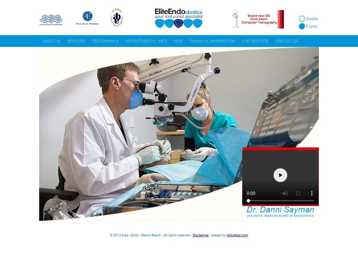
Hey there! Endodontics is the part of dentistry that focuses on the stuff inside teeth – you know, the root canals, nerves, blood vessels, all that good stuff. If you’re an endodontist looking to get more patients, having a killer website is a must these days.
Your site is like your digital storefront, giving you a chance to show off what makes your practice unique. Whether you use fun colors, cool photos, or just drop some knowledge, you gotta help potential patients get to know you.
That’s why I put together this gallery of different endo website examples. You can get ideas on styles, designs, content, and more from these sites made by real-life root canal docs across the country.
How to Design a Great Endodontic Website
-
Listen up, endodontists – having a killer website is non-negotiable these days if you want to attract new patients. Take it from me, someone who has designed sites for all kinds of medical practices.
First things first – that website better be easy to use on mobile phones and tablets. Let’s be real, most people are glued to their devices 24/7, so you gotta be mobile-friendly.
Next, spice up your site with high-quality photos and videos that really showcase your office and procedures. Think of it like an HGTV show – you gotta showcase the goods! Shutterstock is a goldmine for dental images.
Your writing needs to be conversational and engaging too. Explain root canals and such in simple terms – think Dr. Seuss style. And don’t be afraid to use humor and personality!
Now let’s turbo-charge things for search engines. Sprinkle in relevant keywords throughout your site like “root canal” and “pulp extirpation.” This is like leaving a trail of breadcrumbs for patients to find you. But don’t go keyword crazy or your site will read like spam.
Real patient stories and testimonials are gold – ask happy patients to share their experiences. This builds trust fast!
Make sure your contact info is crystal clear. Think bright neon lights guiding patients to your phone number and email.
Keep things fresh by updating your site regularly – add new procedures, technologies, etc. Think of it like spring cleaning, but for your website!
Work with a web designer who knows endodontics inside and out. Their expertise is worth the investment, even if it costs more upfront. Don’t DIY this unless you’re also an amazing web developer.
Use analytics to see how your site is performing. Focus on the important stuff like traffic sources and time on page. But don’t get overwhelmed by all the data – just check in once a month like you would the gas and electric bill.
Check out other awesome endodontic sites for inspiration on content and design. Borrow their best ideas to make your site stand out!


