Exploring Strategic Use of Grey in Healthcare Website Design
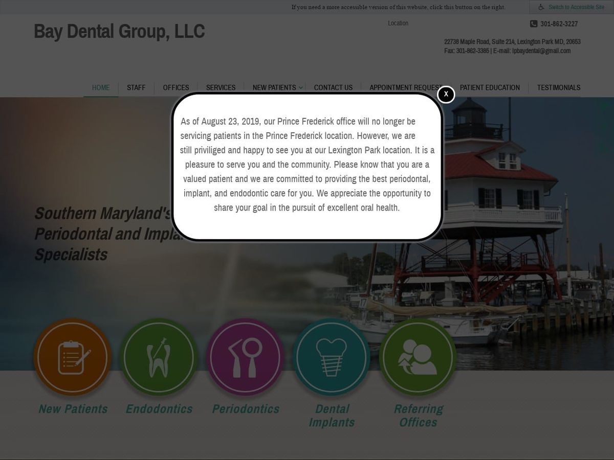
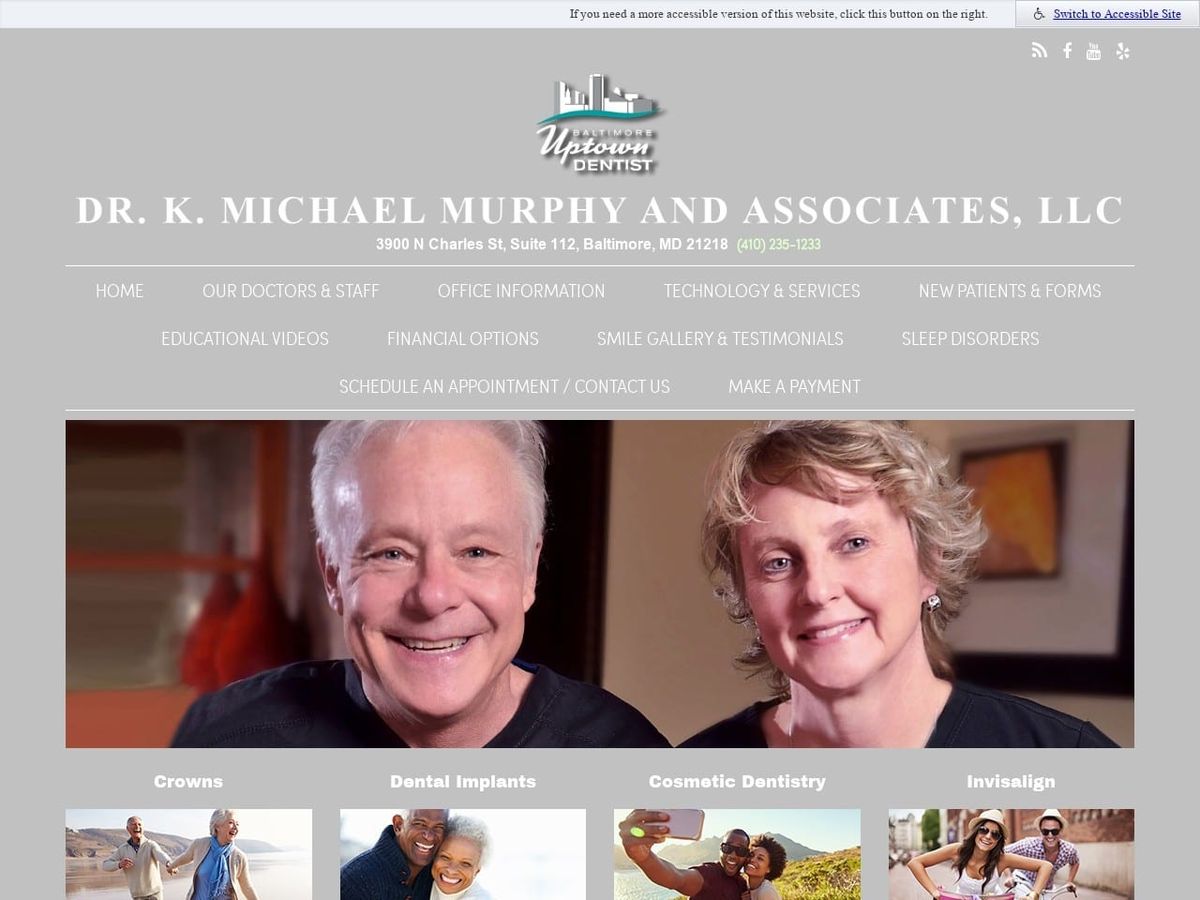
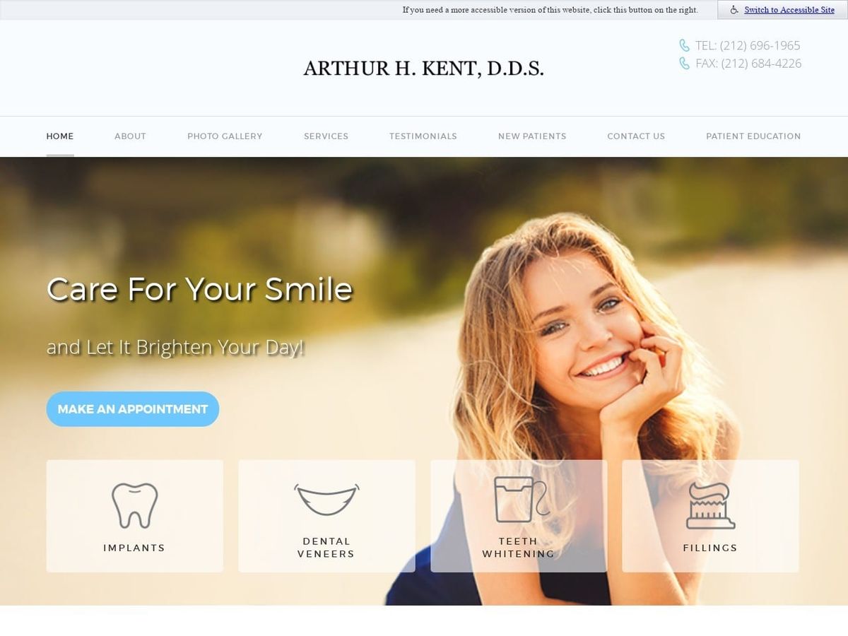
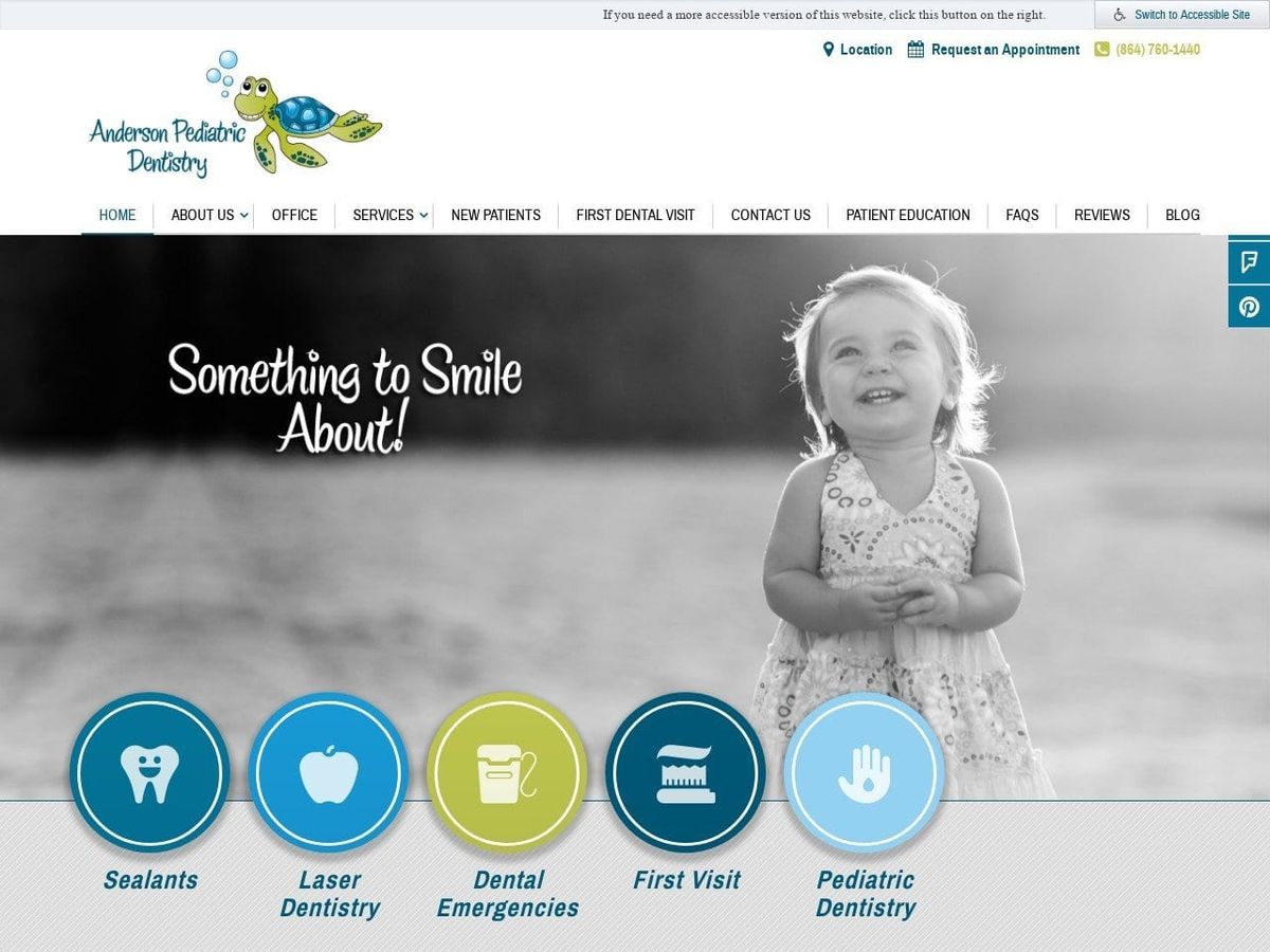
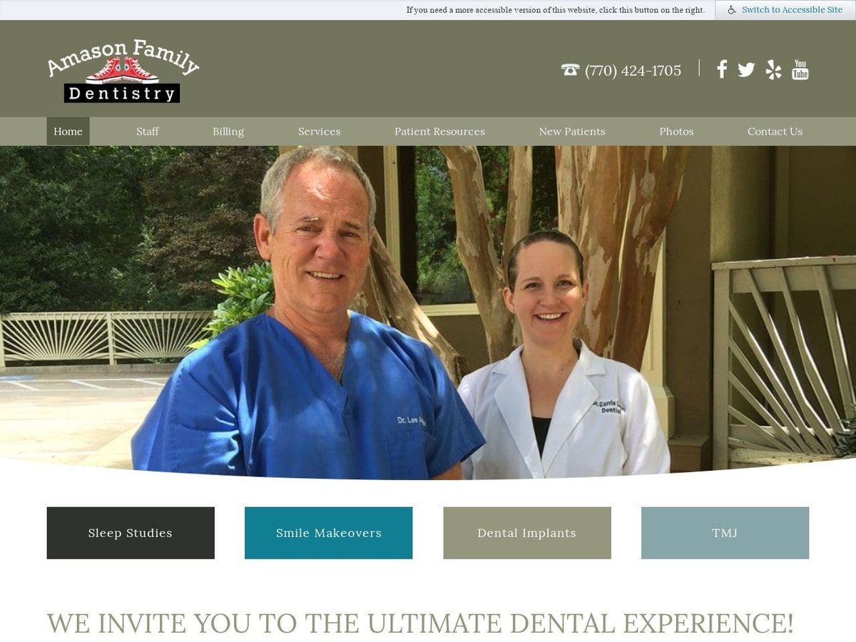
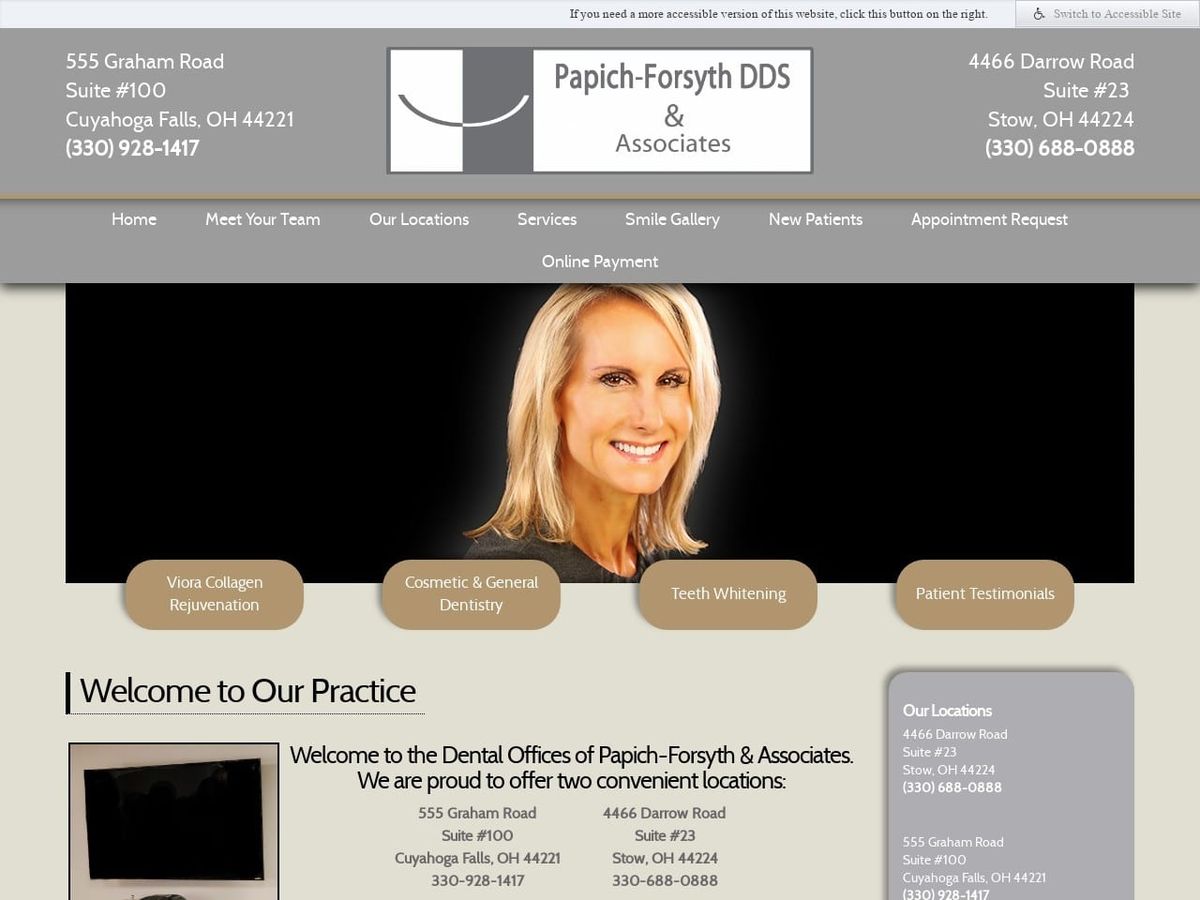
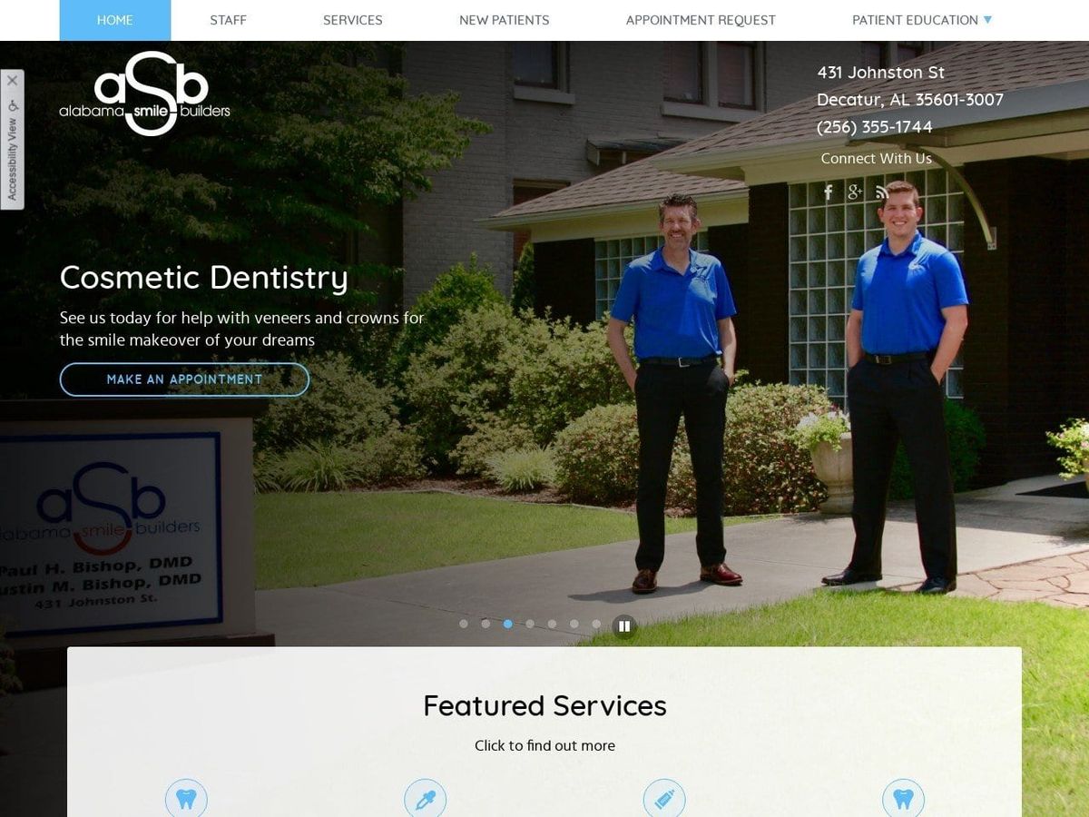
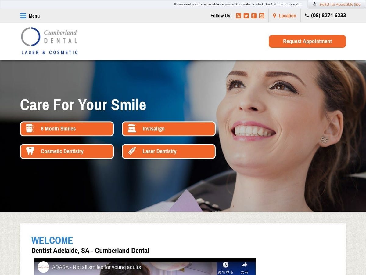
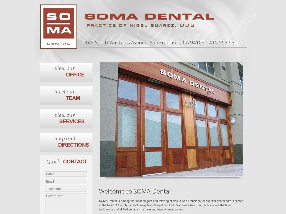
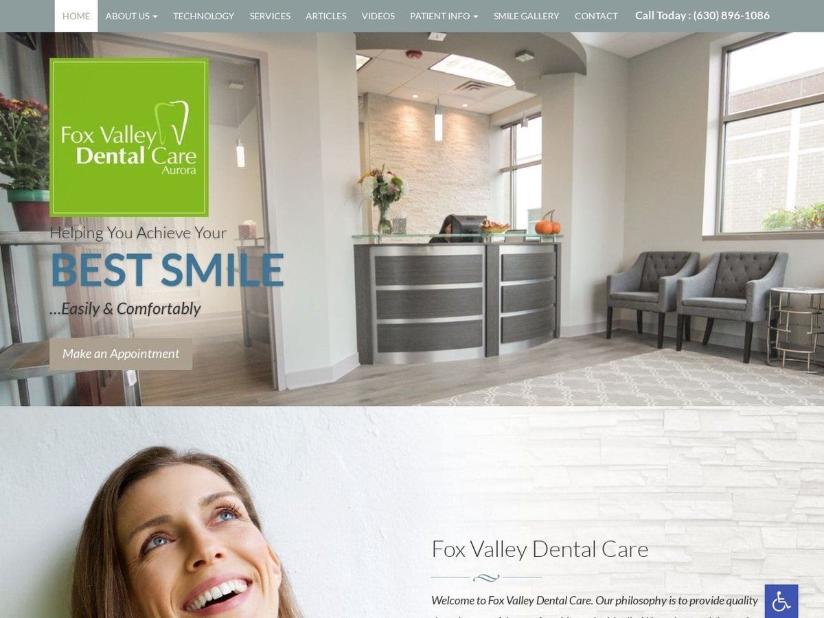
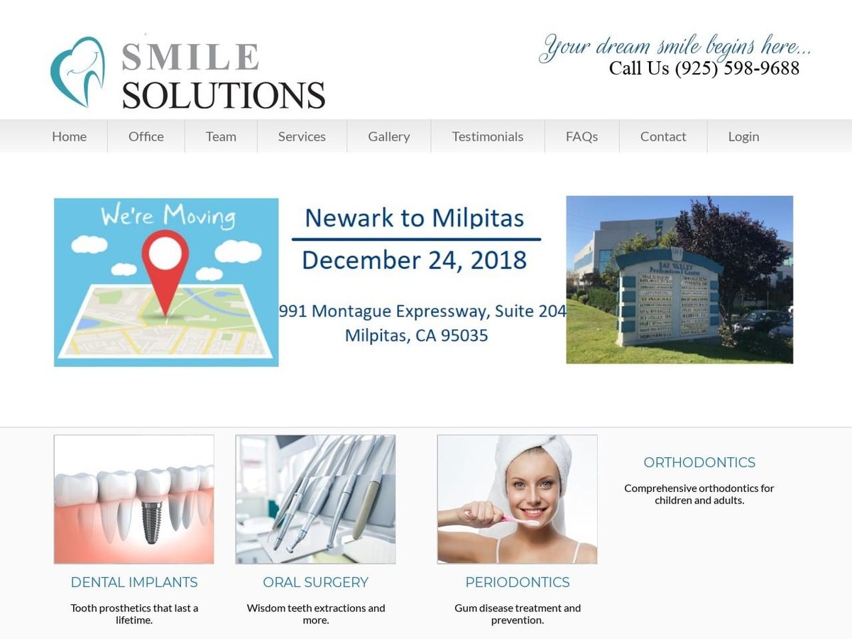
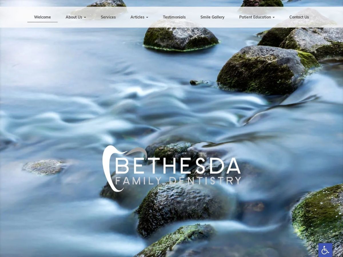
Welcome to our gallery showcasing effective and sophisticated uses of the color grey in healthcare and dental website design. Grey can be leveraged skillfully to create an upscale, professional appearance.
The Power of Grey in Healthcare Design
Grey signifies neutrality and balance, exuding sophistication and modern elegance – ideals aligned with quality care.
Benefits of Using Grey Strategically
- Conveys professionalism, competence and reliability
- Provides versatility from cool greys to warm greys
- Instills a sense of stability and calmness for visitors
- Creates an upscale, elegant aesthetic for clinics
- Works well as a background color to perfectly frame content
Evaluating Impactful Uses of Grey
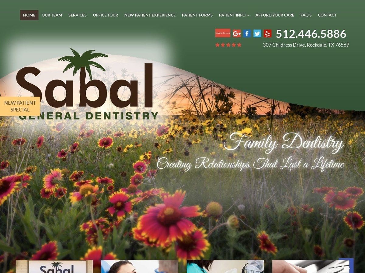
Our gallery includes outstanding examples of grey used effectively alongside poor uses like bland or dull shades.
Let Our Gallery Inspire Your Use of Grey
Discover how incorporating grey can establish just the right tone for your healthcare or dental website’s brand and atmosphere. Let these curated examples spark creative grey design ideas.
