Exploring Strategic Use of Brown in Healthcare Website Design
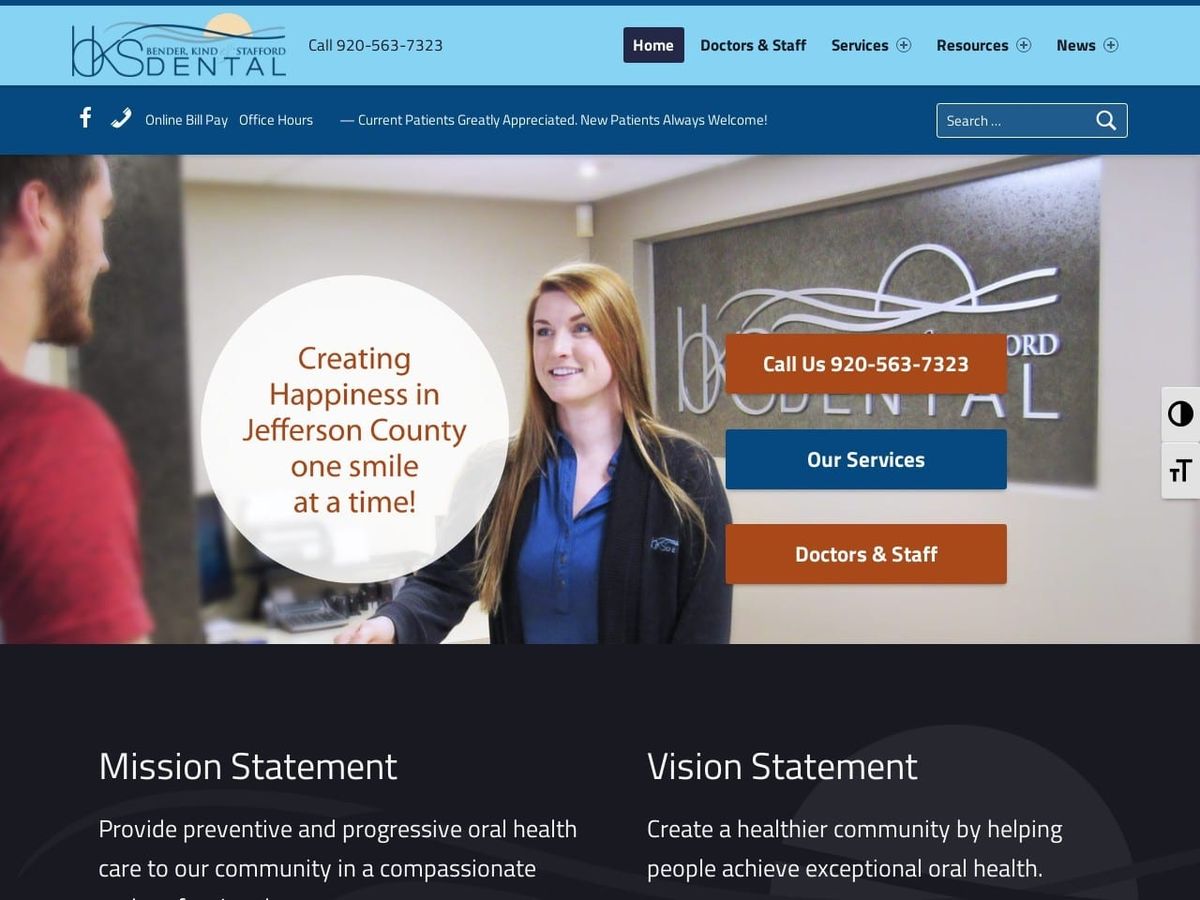
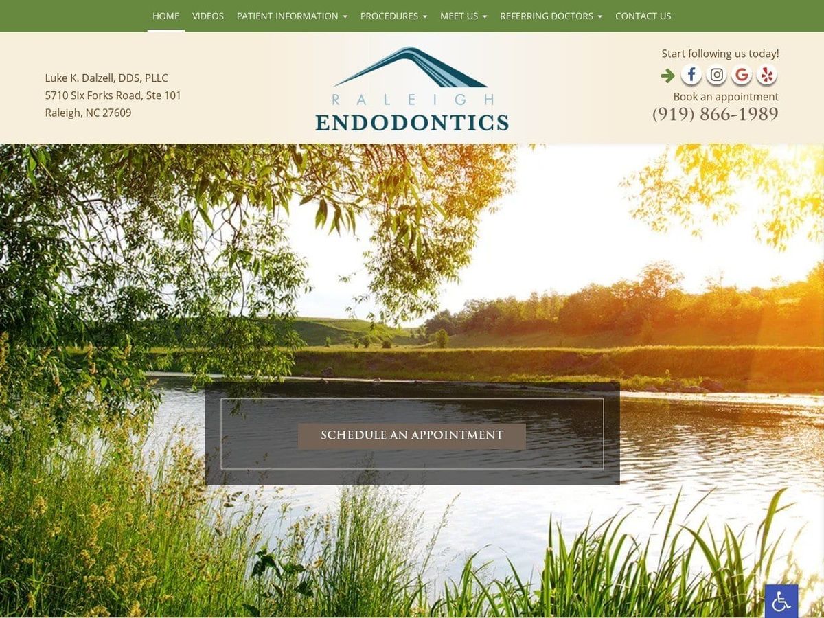
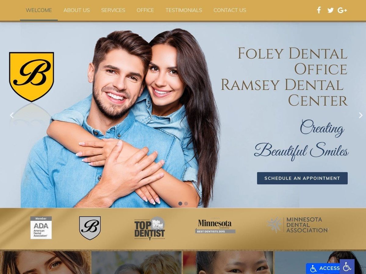
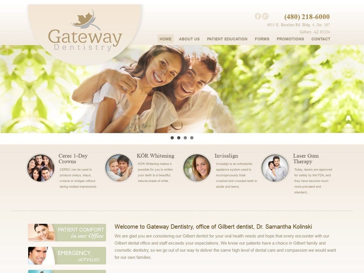
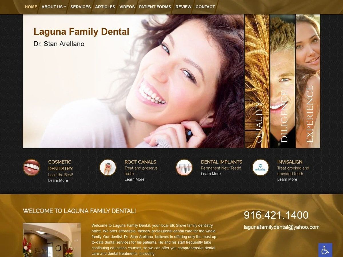
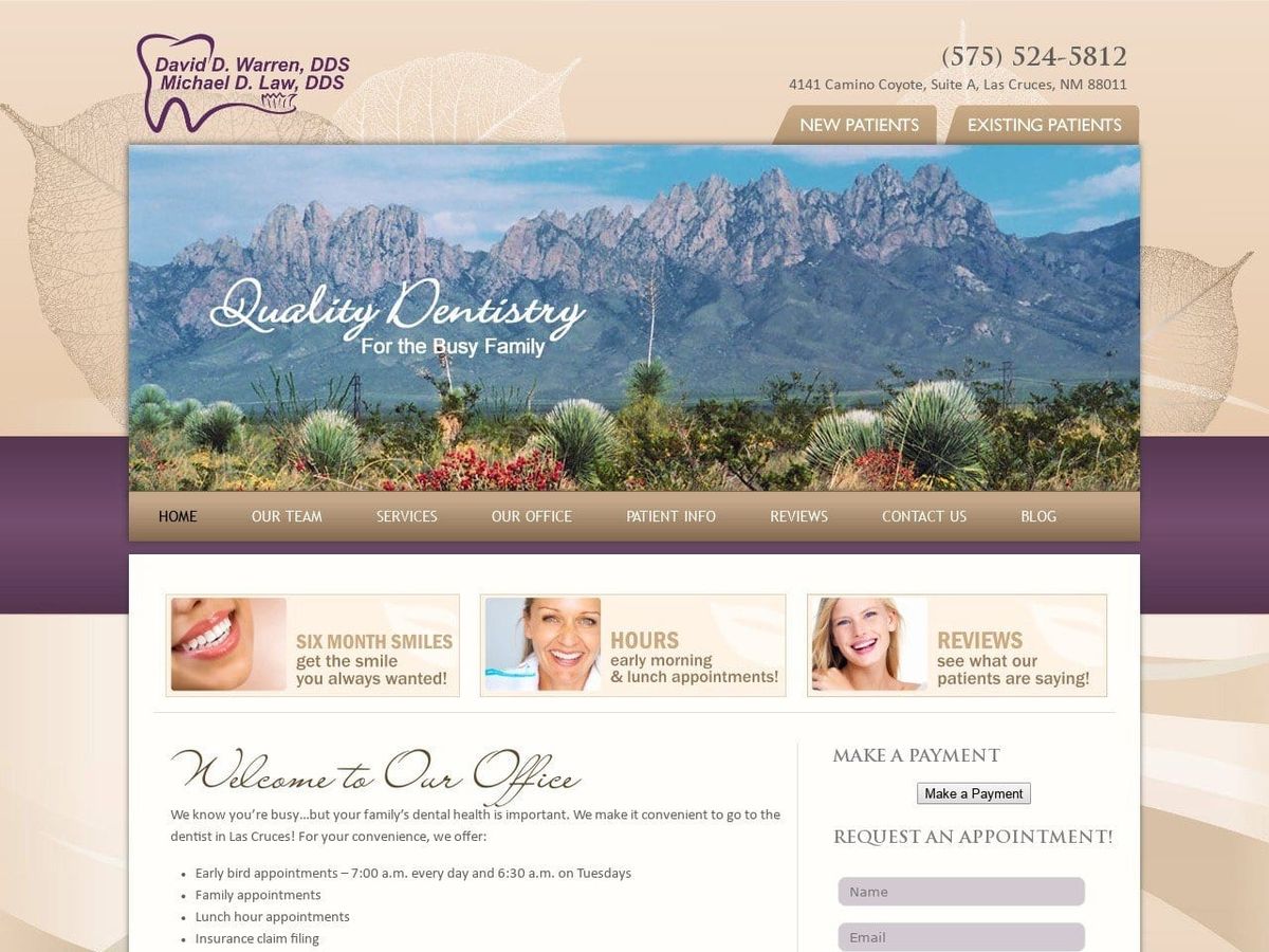
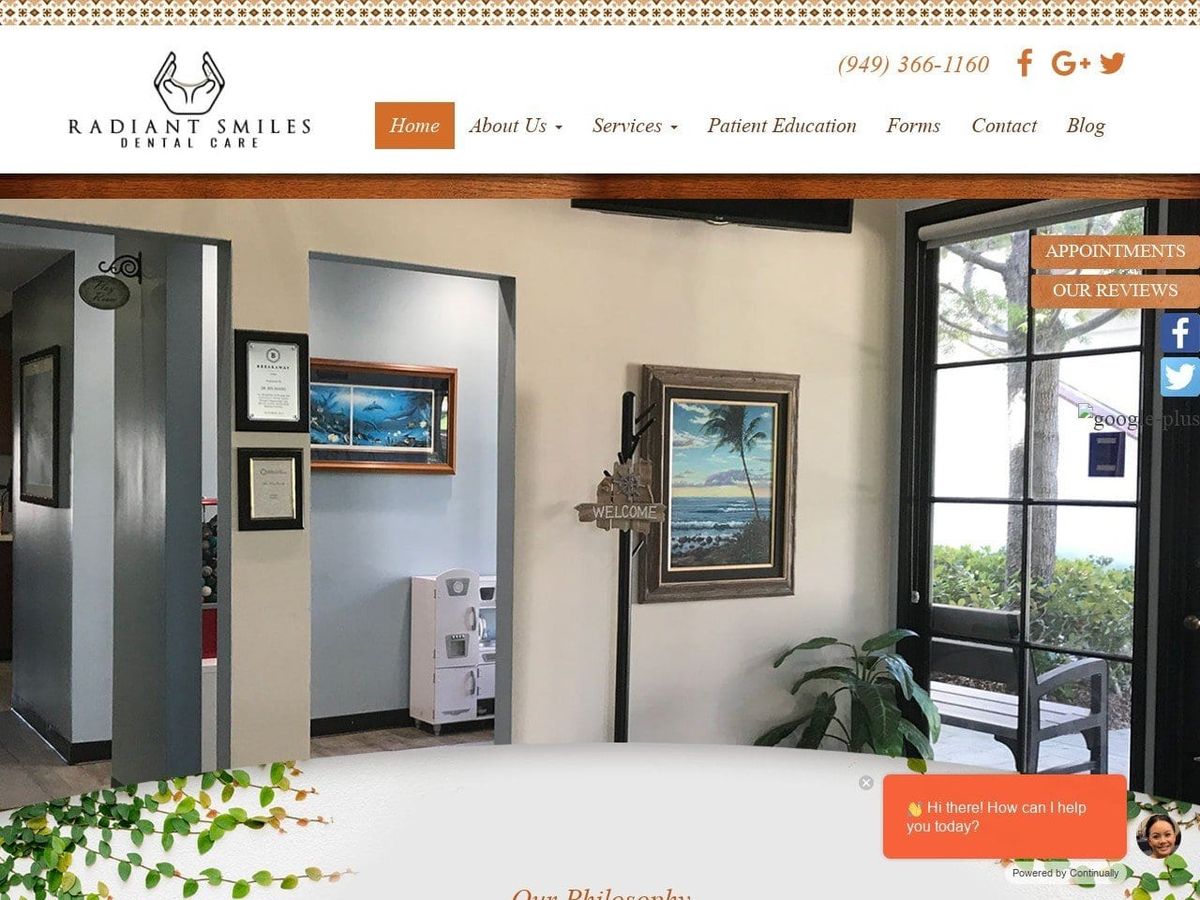
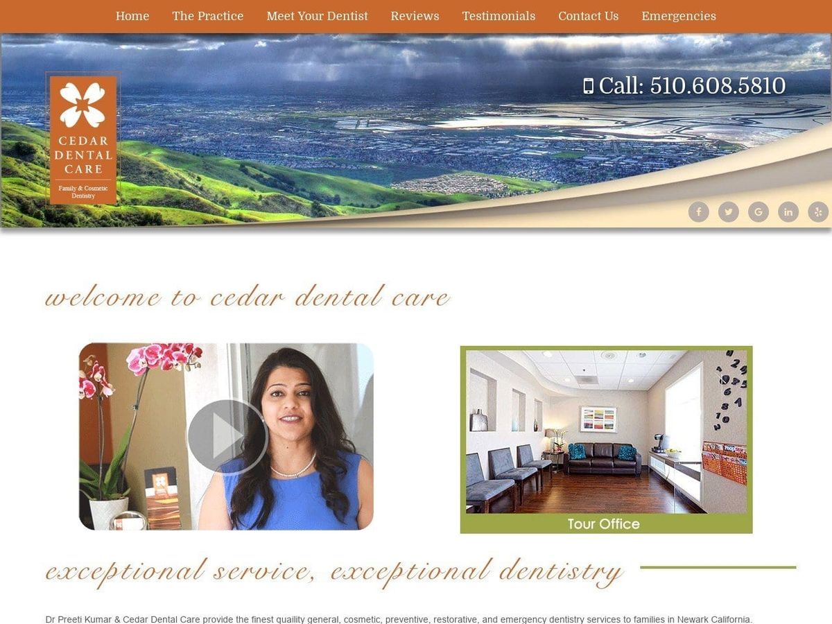
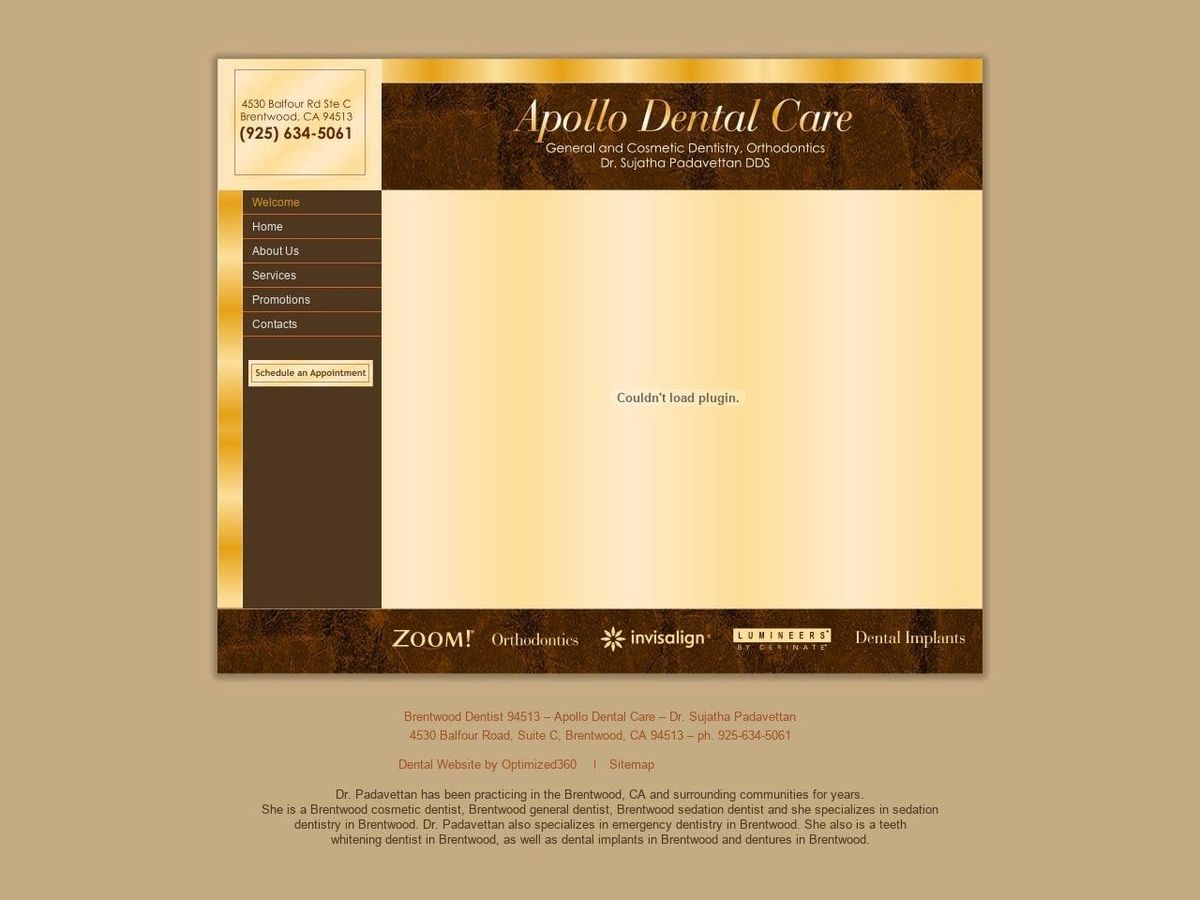
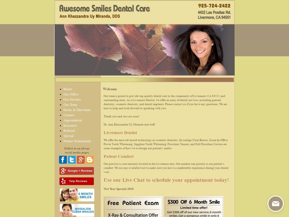
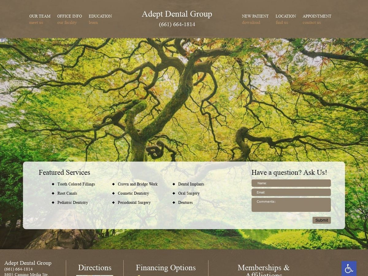
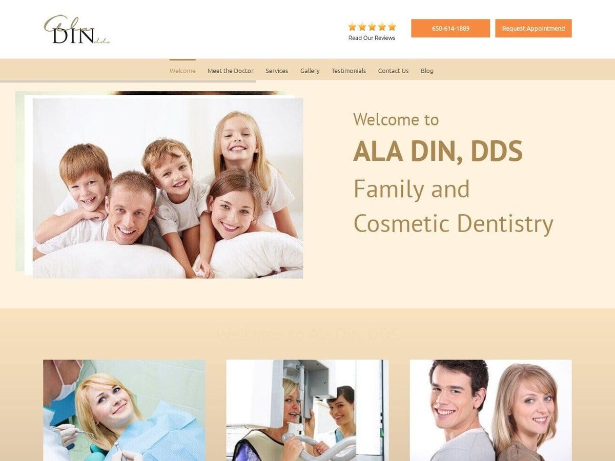
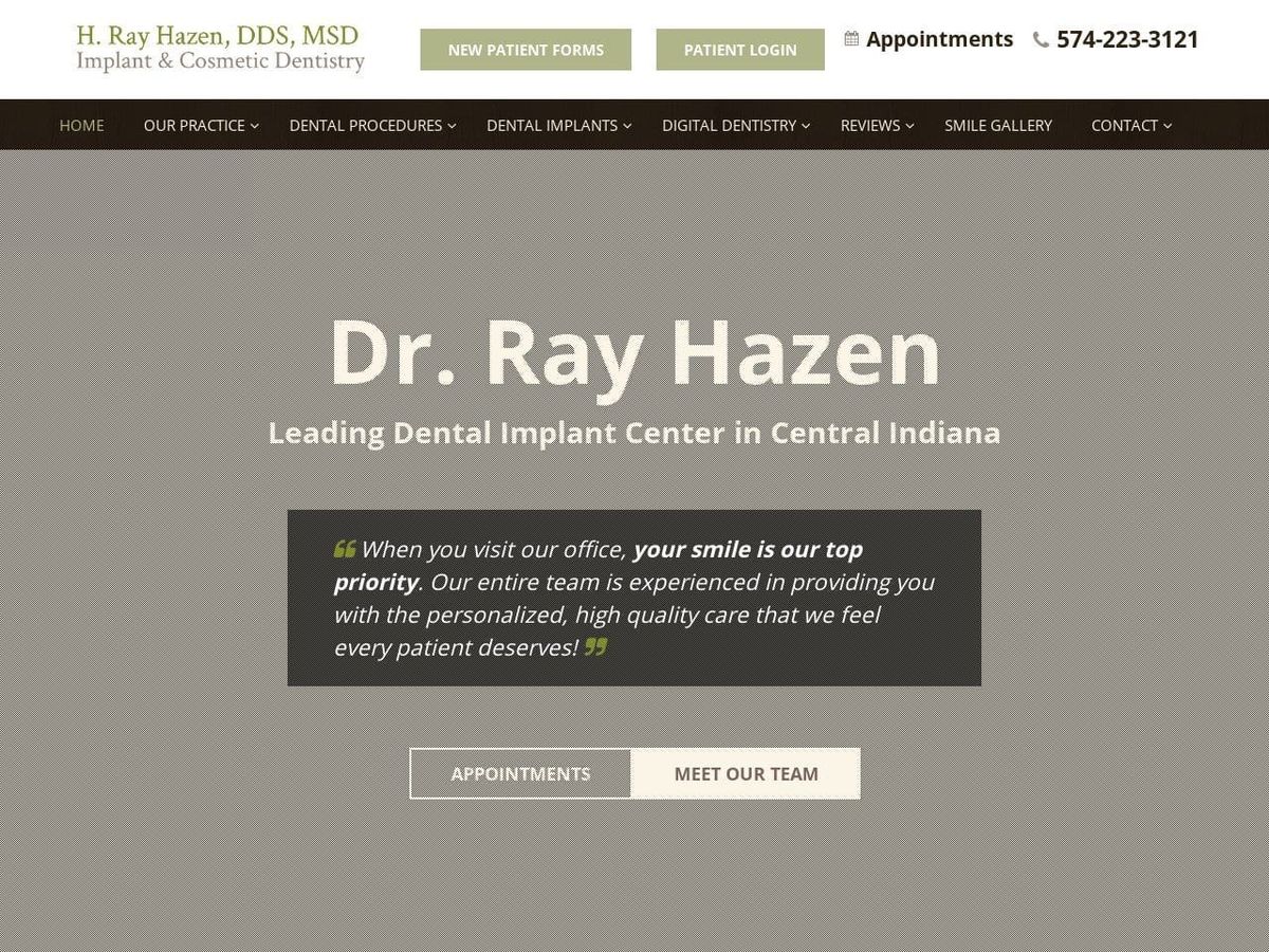
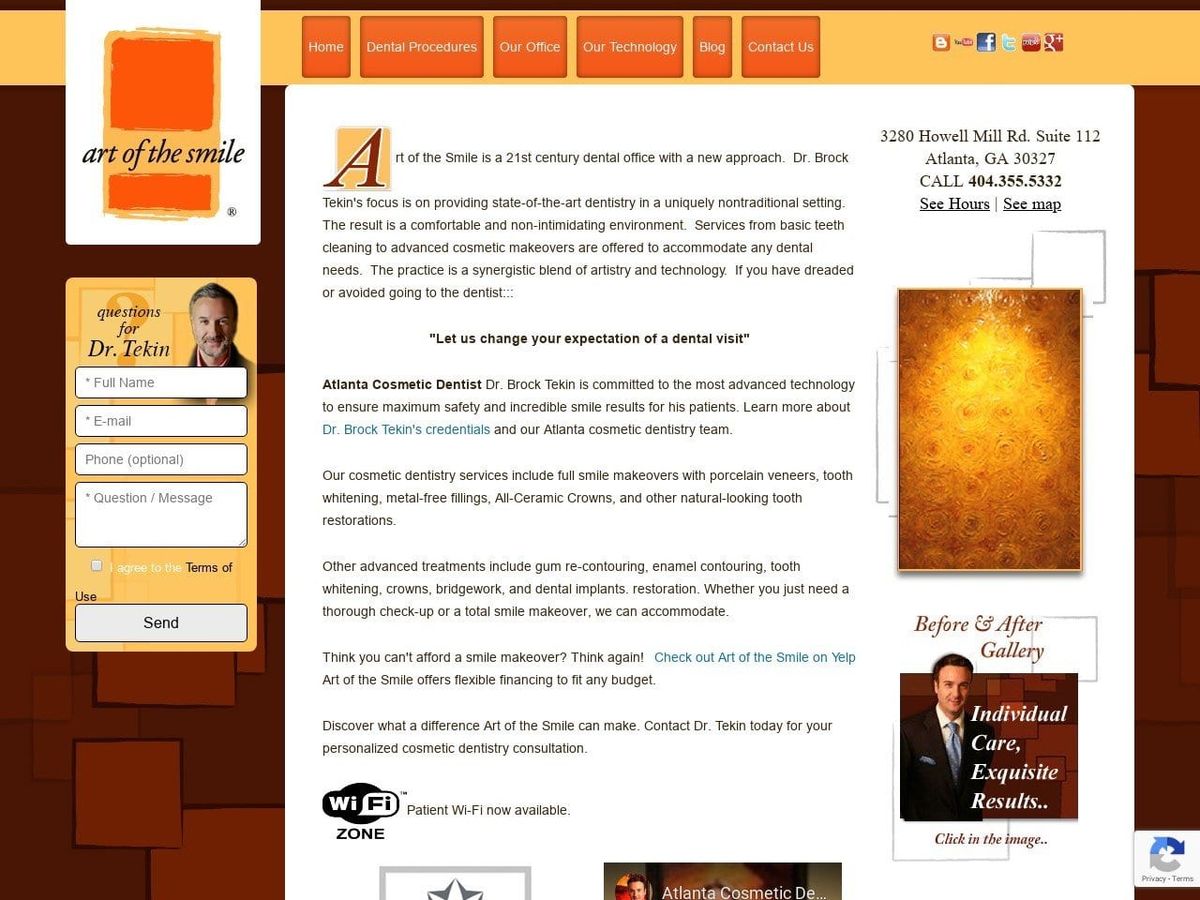
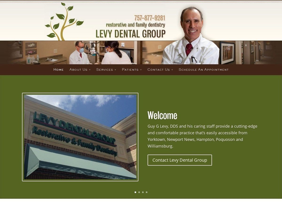
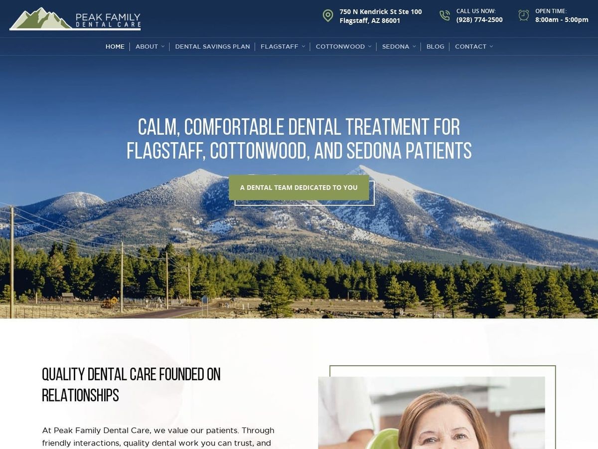
Welcome to our gallery showcasing effective and evocative uses of the color brown in healthcare and dental website design. Brown can be leveraged skillfully to create warmth, comfort, and connection.
The Power of Brown in Healthcare Design
Brown evokes familiarity and stability, symbolizing earthiness and nature – ideal for healthcare sites promoting sustainability or holistic wellness. It also conveys sophistication and luxury for upscale clinics.
Benefits of Using Brown Thoughtfully
- Radiates warmth and relaxation to make visitors feel welcomed
- Instills trust and rapport through its comforting familiarity
- Grounds a brand with earthy natural tones
- Can establish an upscale, sophisticated aesthetic
- Evokes coziness and invites visitors in
Evaluating Impactful Uses of Brown
Our gallery includes outstanding examples of brown used effectively alongside poor uses like overwhelming or clashing shades.
Let Our Gallery Inspire Your Use of Brown
Discover how strategic incorporation of brown’s versatility can create the perfect atmosphere for your healthcare or dental website. Let these curated examples spark creative brown design ideas.
