Exploring Strategic Use of Black in Healthcare Website Design
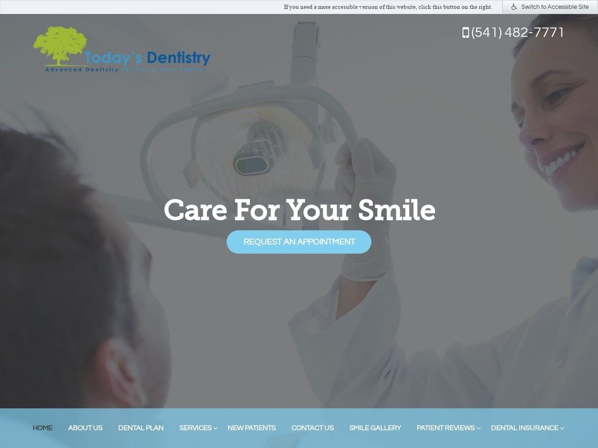
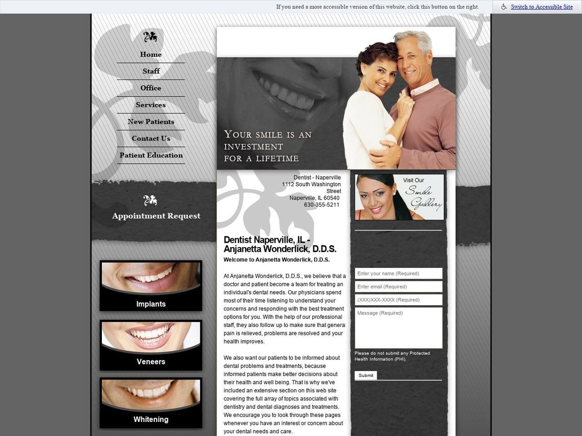
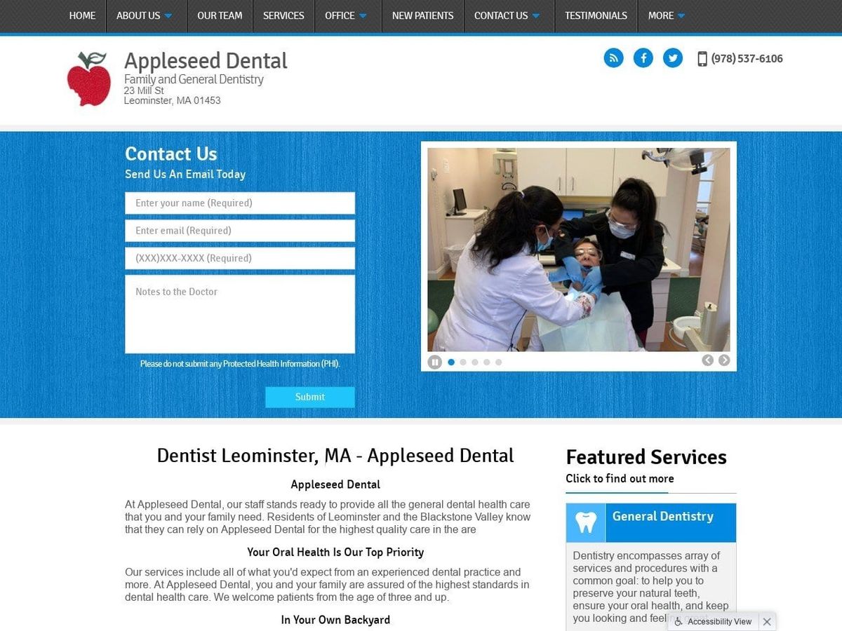
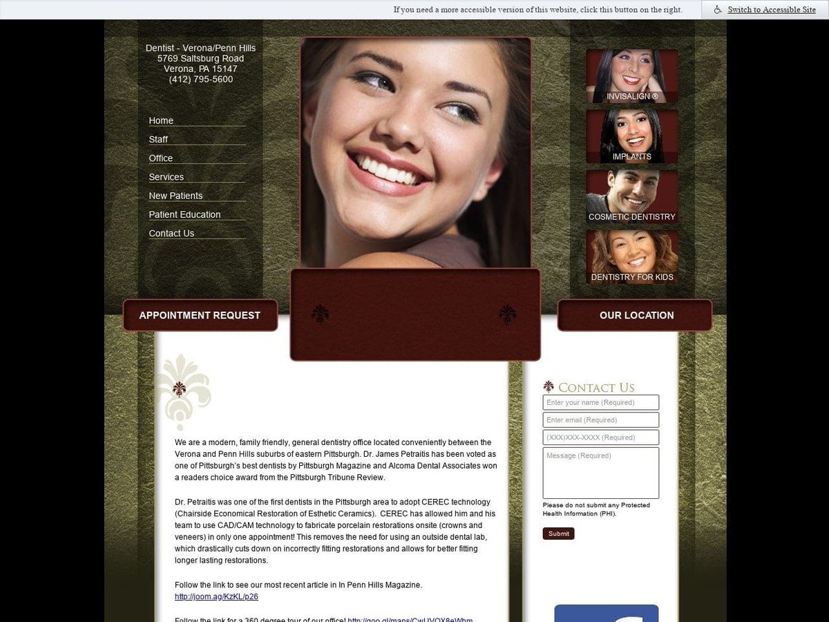
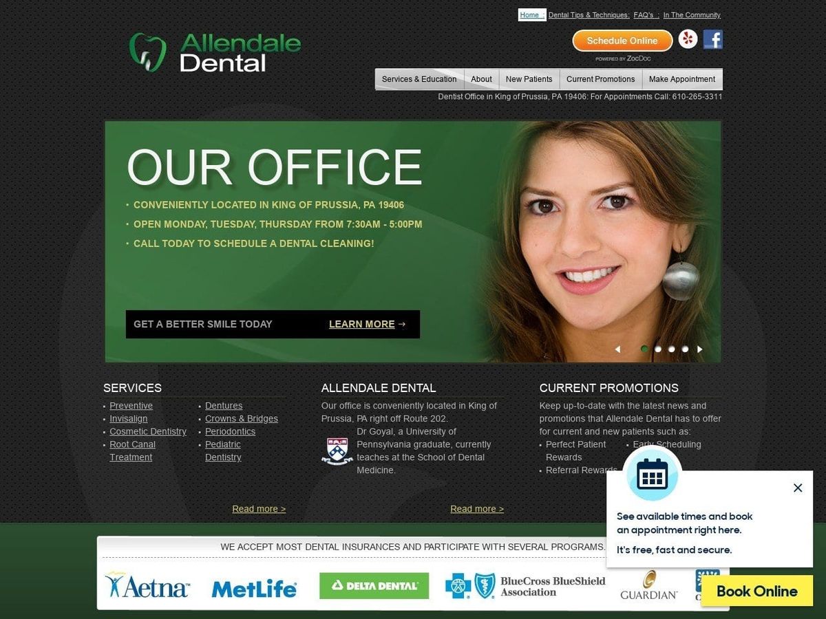
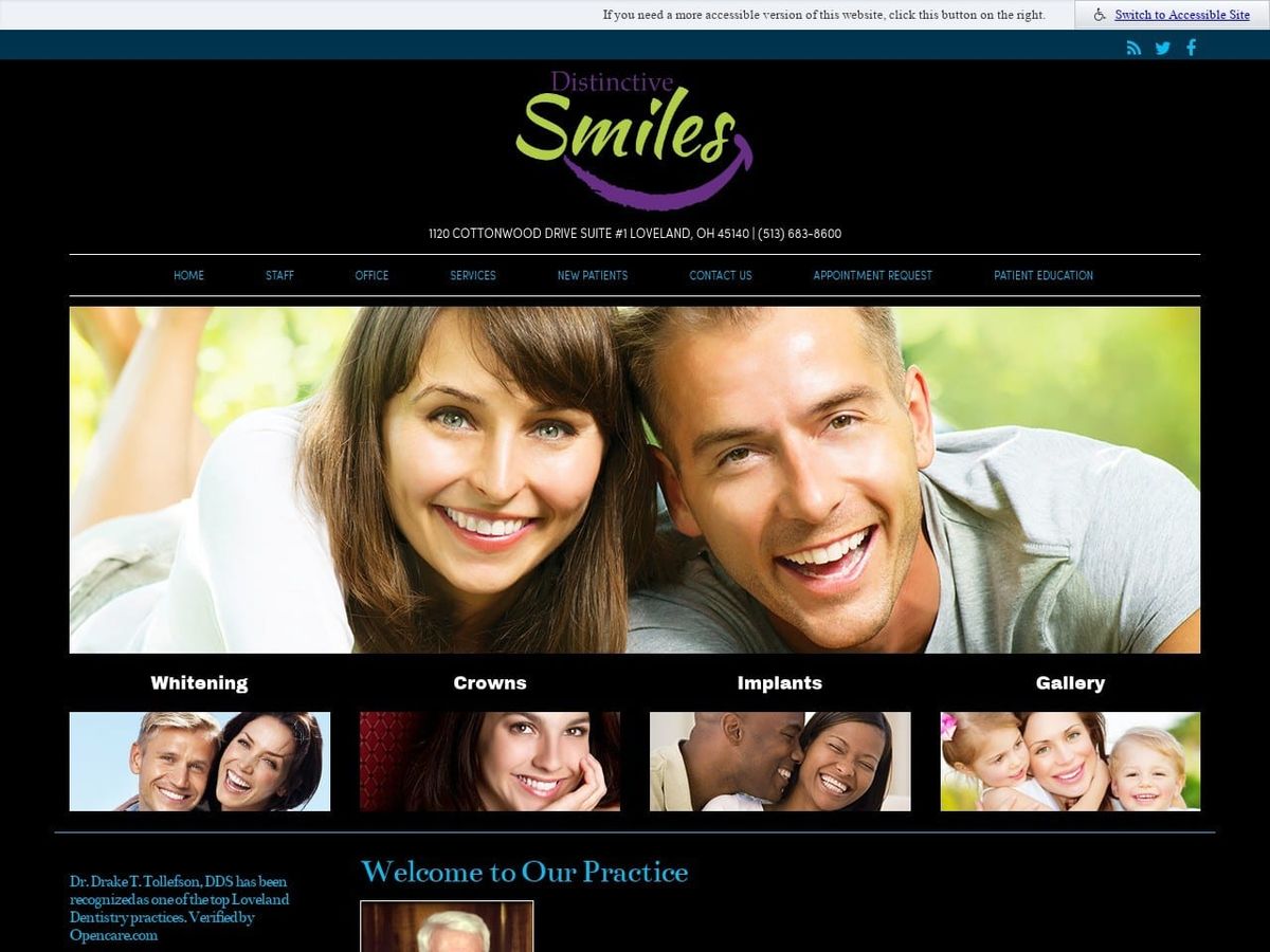
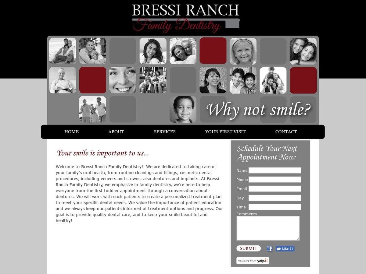
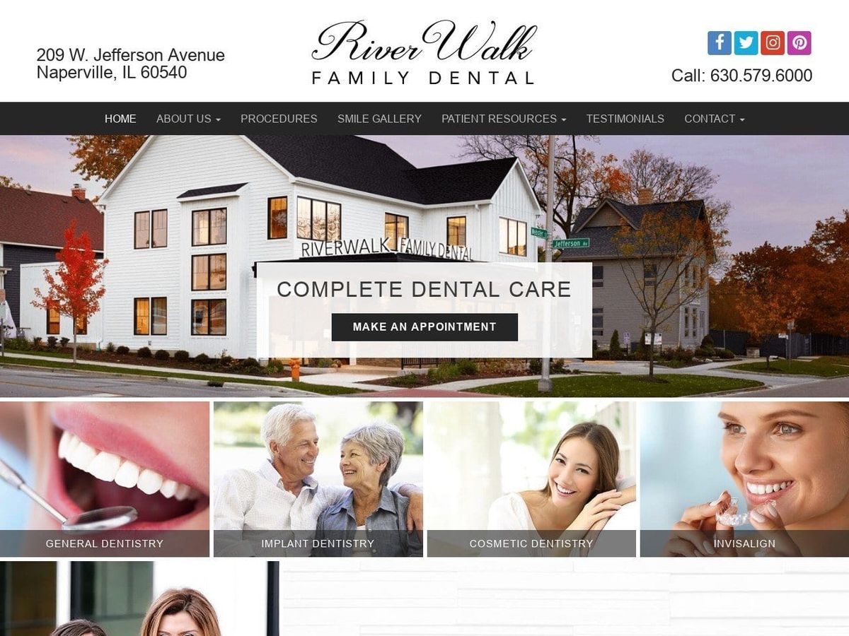
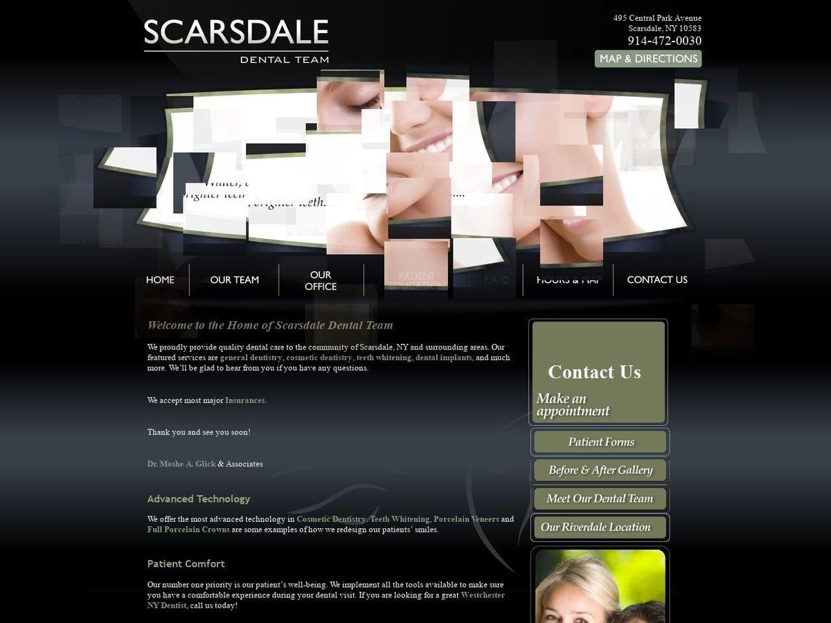
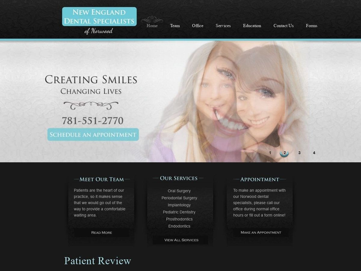
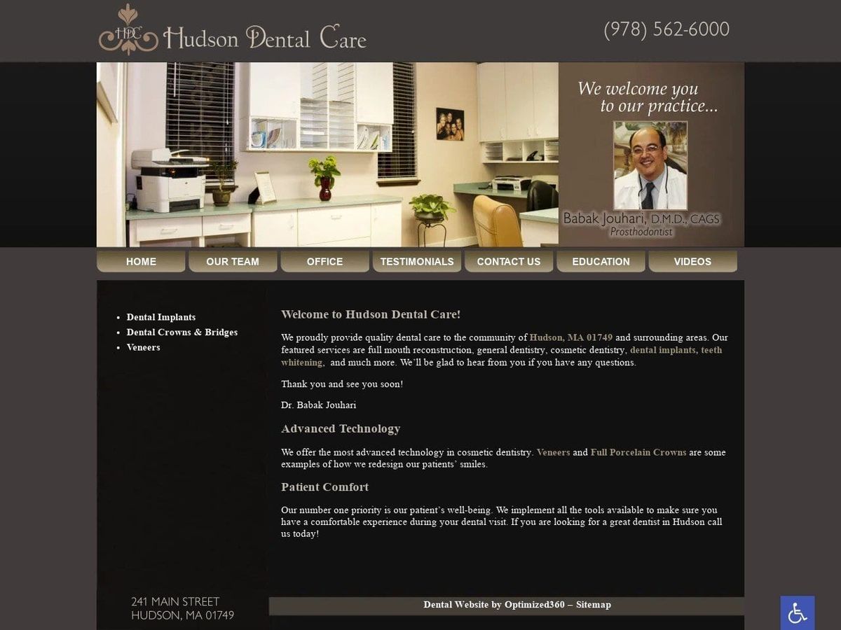
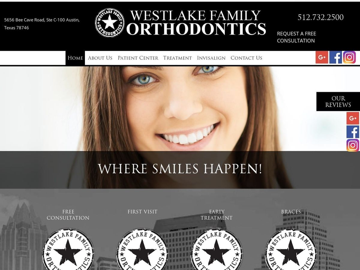
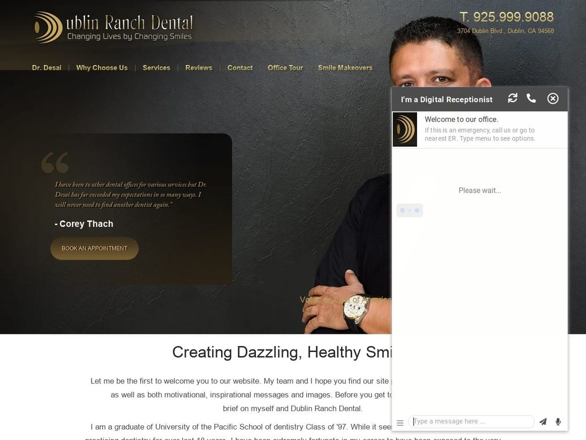
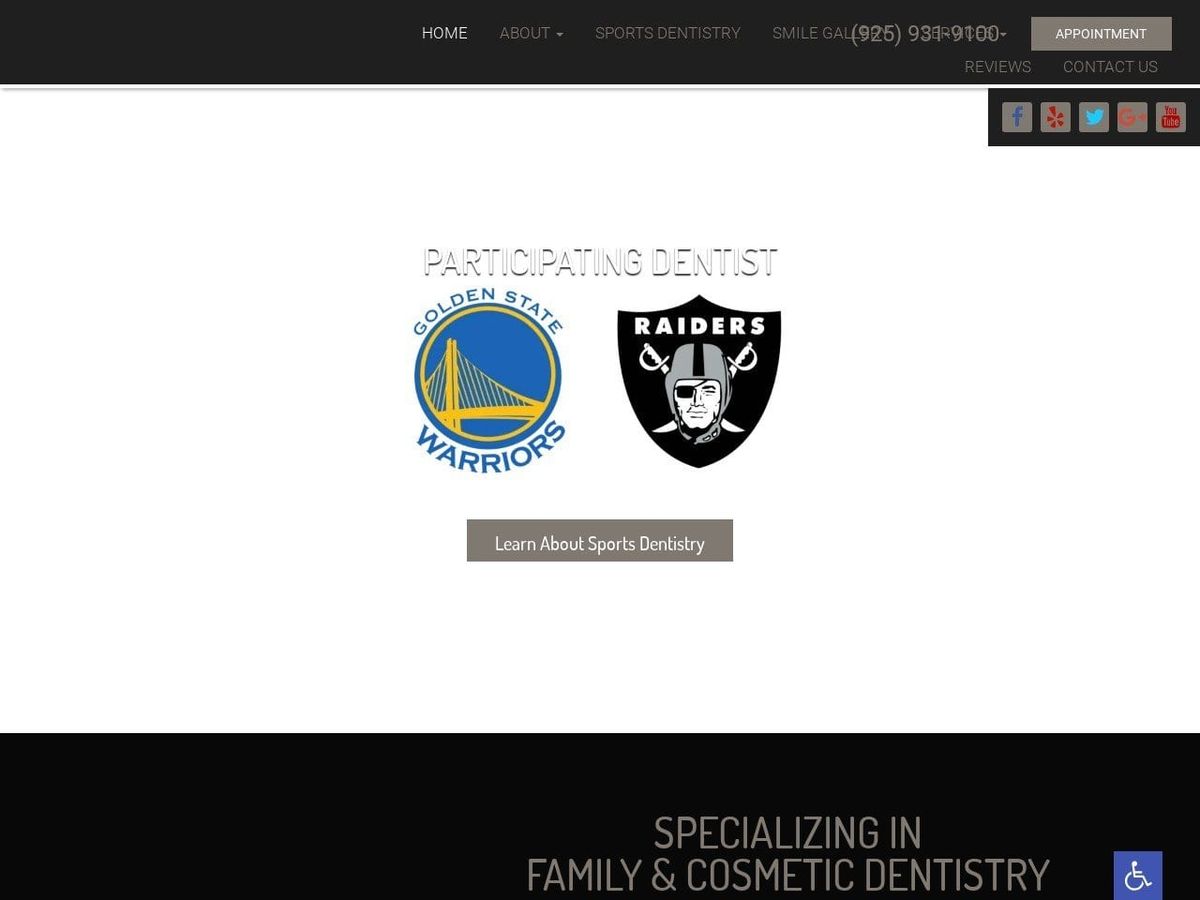
Welcome to our gallery showcasing effective and striking uses of the color black in healthcare and dental website design. We present a curated collection of examples where black is leveraged to convey elegance, professionalism, and visual impact.
The Power of Black in Healthcare Design
Black carries unique significance in healthcare and dentistry sites. It exudes authority and trust while creating high-contrast visuals that enhance the visibility of important information and images.
Benefits of Using Black Strategically
- Conveys a sense of sophistication and modern aesthetic
- Instills professionalism, competence and confidence
- Provides striking contrast to make key elements stand out
- Can evoke an elegant, luxurious feel or sense of calmness
- Creates memorable visual impact and bold branding
Evaluating Effective vs. Ineffective Uses of Black
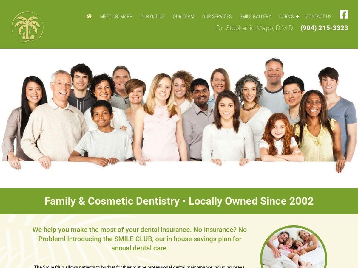
Our gallery includes both effective and ineffective uses of black, so you can see outstanding examples alongside design missteps like black backgrounds on pediatric sites.
Let Our Gallery Inspire Your Black Design Approach
Discover how the careful, strategic use of black can elevate your healthcare or dental website design. Let these curated examples ignite ideas for leveraging black in a visually striking yet professional way.
