A dental website is an excellent marketing tool and can bring you, new ortho patients. But it must look professional to generate more interest. You need to make your website look clean and easy to navigate. It should be easy to find your services and have features that will make you stand out. You should keep the elements simple but also use plenty of white space. An orthodontic website designer can provide you with these features and more. Read on to learn more.
Avoid high-volume companies
There are several common mistakes that orthodontists make when designing a website. One mistake is choosing a company that has a high volume. Such a company will probably not provide the service that the practice wants. Instead, they will make money from the site’s traffic. Another mistake is choosing a high-volume company that lacks expertise. Hiring an experienced and qualified company with many years of experience in dental marketing, specifically in orthodontics, is best.

Secondly, the site must load quickly. The web pages should load in at most 3-4 seconds. The speed of the site is an essential factor in SEO. The website should also have good content. The page should be easy to navigate and offer helpful information for the visitor. It is not optimized for mobile devices if it takes longer than three seconds. The website must have SEO features so that it will be optimized for mobile devices. High-volume companies that do not optimize their sites for mobile devices will get penalized by search engines. Competing with these companies without a mobile version is like boxing with your hands behind your back.
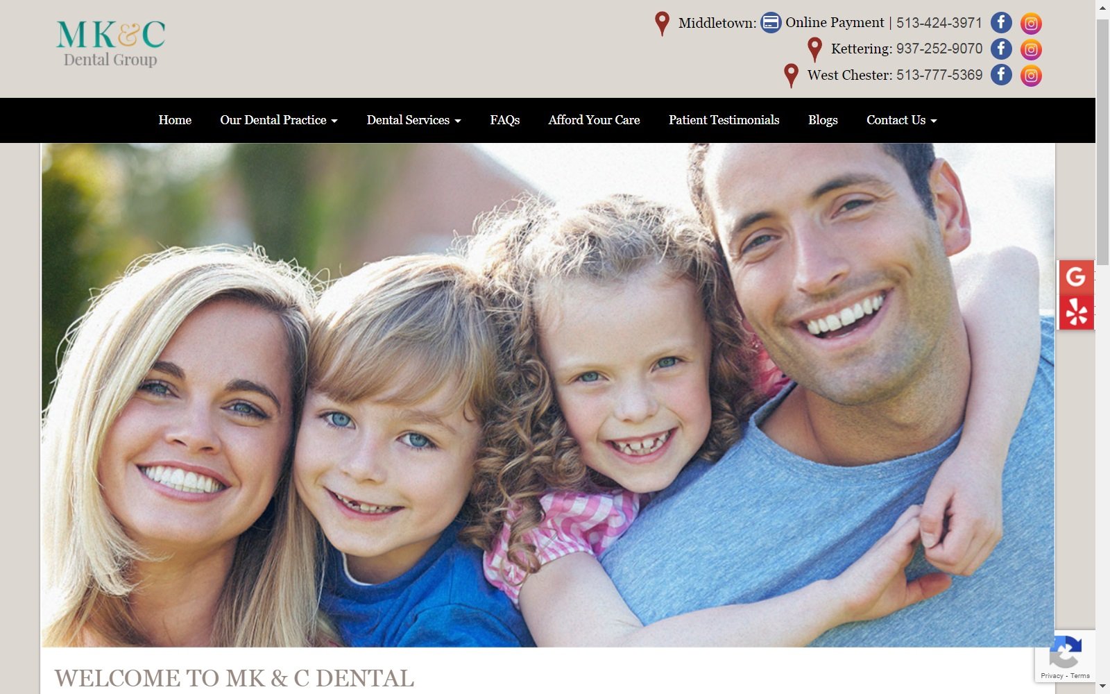
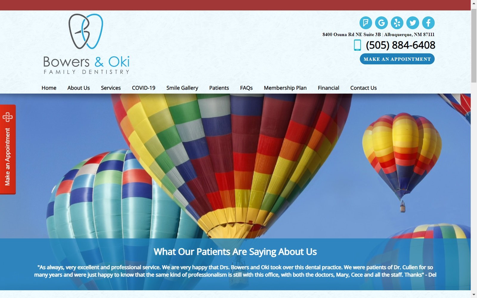
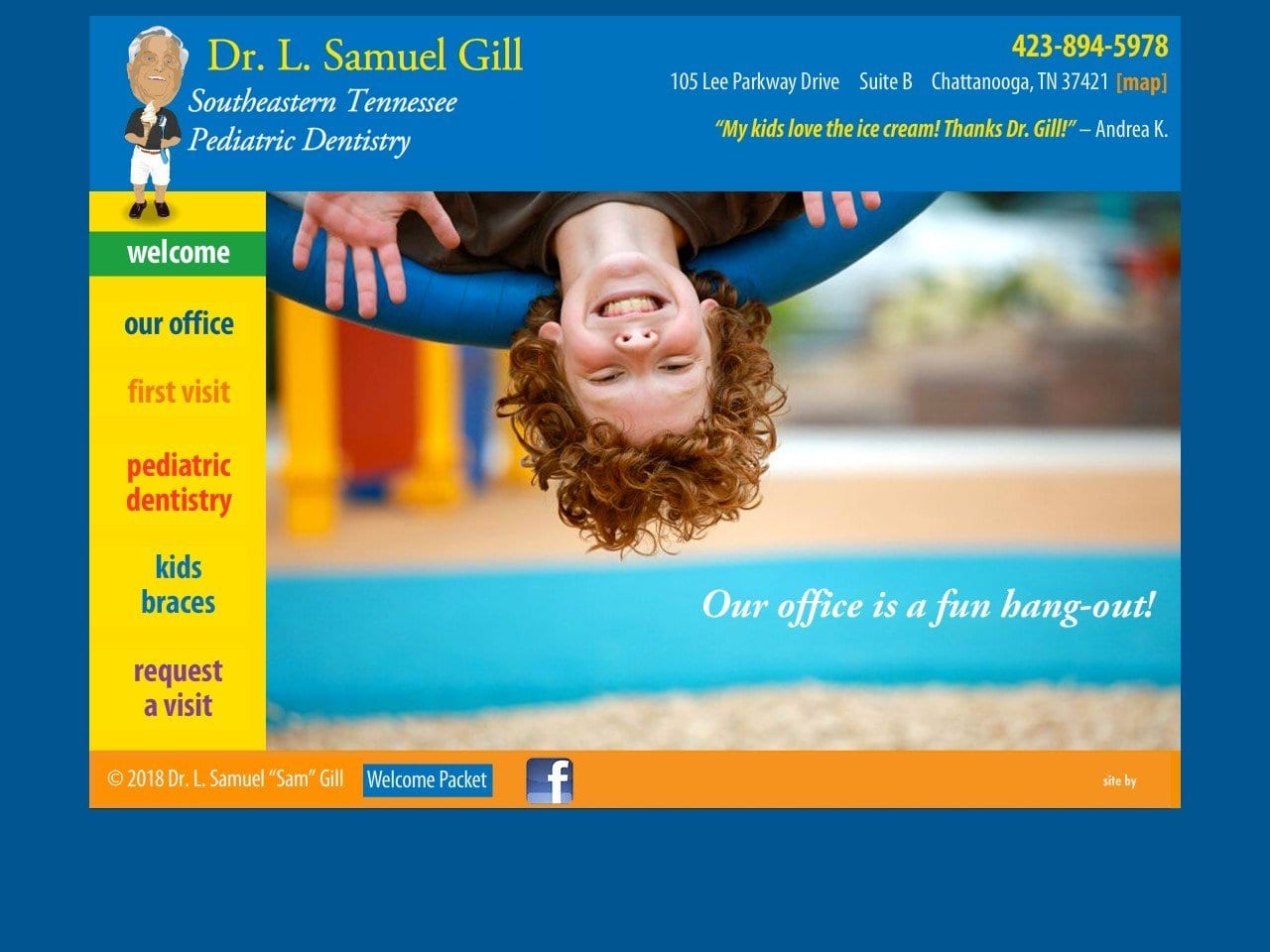
7 Dental Websites to be Inspired by
Look for a company with a data-driven approach.
When choosing a web design company for your ortho practice, it’s essential to find a firm focused on user-friendliness. An excellent dental website should be capable of connecting with patients and attracting new patients. A company with an analytical approach to design will be able to help you create a website that converts visitors into booked appointments. By focusing on the user experience, these companies will help you build an excellent website that will help your practice grow.

Data-driven design is the best way to ensure that your website gets the most visitors. Today’s website visitors are impatient and are quick to click away if the website isn’t easy to navigate. A dental website designer should consider visitors’ paths to visit different website pages and make navigation easy. The layout should be consistent with keeping visitors on track.
How to Find a Great Web Designer for Your Dental Website
Consider a company with a mobile-friendly design.
A responsive design for your website is a necessity. Over half of your visitors will be on a mobile device, so your site needs to load quickly and look great no matter their use. Choosing a mobile-friendly design can give your website a more mobile-friendly experience, improving your site’s conversion rate. Not to mention, a mobile-friendly design is more likely to generate new patient calls!

A modern dental website should reflect your practice’s goals, be informative and engaging, and showcase the services your practice provides. The designer should also be able to integrate social media links, blog posts, and professional graphics to maximize your marketing efforts. If you’re looking for a mobile-friendly design, you should choose a San Antonio-based designer with extensive experience designing responsive websites. This way, you can reach out to new patients and improve your practice’s reputation.
Ask for references
A dental website should have a straightforward menu and shortcuts to essential pages. It should include patient portal access and forms for medical history and insurance. The patient’s experience should be personalized, and the patient should be able to find the information they need without difficulty. Effective websites offer a navigation trail, which includes icons and bullet points that direct users to the pages they need most. Ideally, a dental website should also provide patients a way to get in touch with the practice.

For orthodontist websites, it is important to realize you have two different target groups. Patients and their parents. So, the site needs to work for teens and parents looking for braces for their children.
A dental website should convey empathy, which can help potential patients understand the serious nature of their dental condition. A good color scheme for a dental website is light blue and muted grey. The website should also feature typical patient photographs of different types of cases, including regular braces, esthetic porcelain braces, Invisalign or other invisible appliances, removable appliances, and so on. It is good to look at examples of the designer’s past work. You should check for differences and uniqueness in their work. If possible, ask for references. This will make it easier for you to hire the right person to build your website.


