Learn how to choose typography when designing healthcare web pages.
The fonts you use can help or hurt your branding message.
An attractive, well-designed website is the hallmark of any good medical marketing effort. From the layout of your website to the images you use to the language in your copy, every component of your website serves a purpose.
In this article, we’ll discuss:
The first purpose of your website is to serve as the first impression of your patients. Your website is often the first thing people will notice about your practice. An attractive website that’s easy to navigate will tell people that your business is one that’s trustworthy and takes pride in what it does. A website that’s frustrating and put together with little thought and strategy will tell people that your medical practice doesn’t pay attention to details and does not care about quality.
It’s whatever you want your practice to be known for.
What is Typography?

Typography is the art of arranging type – letters and characters. How you arrange those letters in your design process sends different messages to visitors to your website.
The height, thickness, point size, line length, and spacing all play a role in typography arrangement. In the past, people would arrange letters physically, but thanks to today’s computers, open-source fonts, and photo editing tools, arranging typography is much easier.
What’s the difference between fonts and typefaces?
Although font and typeface are used interchangeably, they actually mean two different things. Typeface refers to what you see in a creative piece, whereas font is the physical collection of letters and characters.
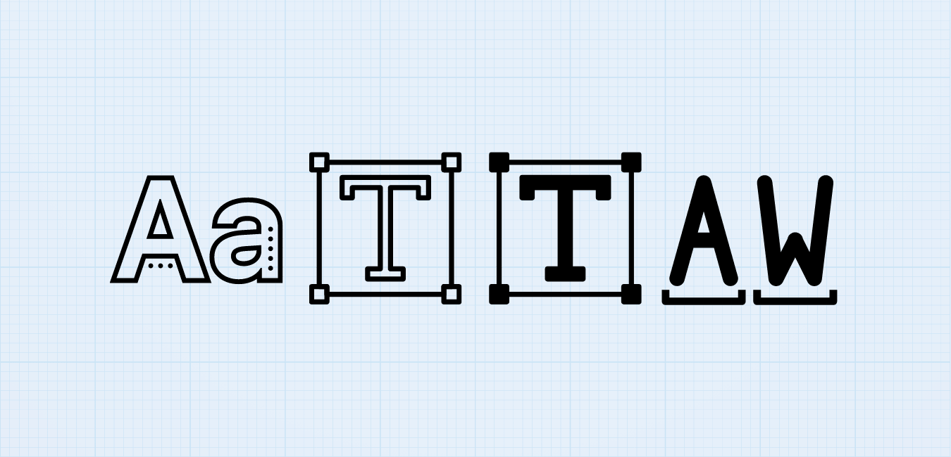
Leading, Kerning, and Spaces
Choose typography that offers optimal white space between alpha and numeric characters so these characters are not misinterpreted. The choice should allow for sufficient leading, kerning, and tracking so these terms do not run together and become misunderstood or difficult to read.
Leading and kerning are adjustments made to space between typed characters in the text. Leading keeps the spaces between lines of text from being too close together. Kerning controls the space between each character so that alpha letters with “tails” or serifs do not cling to characters located before or after them.
Tracking is another part of typography that’s important to understand because it gives a “finished” look to each line of typed text so that important medical terms are not broken up by hyphens or become “widows” and “orphans.” Widows occur when a word hangs on a separate line with a gap in spacing to the rest of the text. An orphan occurs when a paragraph is separated from the rest of the text and is “orphaned” at the bottom of the page or column.
Typeface Terminology
The baseline is the line where the letters sit. The cap height is the distance from the baseline to the top of a capital letter. This comes in handy when aligning type. The X height is situated between the baseline and cap height. It’s the height of the lowercase letter.
The bowl is the curved part of the character that encloses the circular or curved part of letters like ‘d’, ‘b’, and ‘o’. After bowls, you have the serif, which is little projections that finish a stroke in a letter. Think about the little “feet” mentioned above. Finally, the defender is the longest point in a letter that ends below the baseline.
Serif Fonts
Serif fonts are fonts that have little feet. This font is easier to read in long, printed works, which is why it is often used in novels. Common serif fonts include Times New Roman, Georgia, and Garamond. These fonts are easier to read on paper because the letters are quite distinct. They also are used for more professional content.
Sans Serif Font
Sans means without in French. Sans serif means without serifs. You’ll notice these feet do not have the little feet as serif fonts do. Arial and Verdana are common sans-serif fonts. These fonts are often used in web documents and on blogs because they read well on low-screen resolutions and appear more modern.
Blackletter
Goth and Old English are common blackletter fonts. These fonts have thick, thin strokes and were used in Gutenberg’s Bible. They were common before 1500, making them typically used today in documents that are meant to appear historic.
These letters are incredibly difficult to read, which is why when used today it’s typically only in headers or logos. Think of the New York Time’s logo. This likely isn’t something that will be used in website design for medical professionals.
The Best 21 Dental Marketing Companies in the USA
Script Fonts
These fonts are based on handwriting. Think of the beautiful lettering that goes on a wedding invitation. But they’re so much more than that. There are also casual scripts that mimic an individual’s daily handwriting, as opposed to penmanship. It’s a font group that communicates feeling.
The Best Choices of Typography
A good selection of typestyle listed below is a good fit for healthcare-related websites. These are the most recommended by Stanford University for creative, effective marketing and communication as well as branding.
Source Sans Pro, a sans serif type that works well with most medical website text. It is easy on the eyes, especially for lengthy medical and technical white papers.

Crimson Text, stylish type for printed medical communications.

Fjord One, consider using this font as an accent, helping to grab attention quickly.

Other Factors
Browser capabilities. It is important to note that browsers do change font weights according to individual algorithms.
A “font weight” is simply the thickness of the type. The thickness or weight of the typestyle chosen depends on the use of italics, bold, and other character enhancements.
When individuals search for medical websites, the first glance at the site needs to be stylish and informative. It’s shown that websites have less than three seconds to grab attention. So a visitor who is looking for a great physician should not be turned off by the choice of ‘lose’ or ‘immature’ fonts.
Pairing Fonts
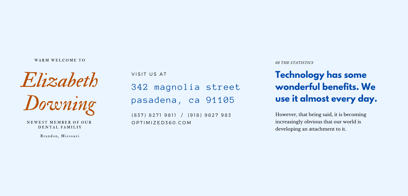
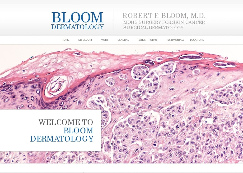
Most websites need at least two types of fonts. There is a need for contrast, so, for medical practice, the choice of sans and sans serif combination is a good start. Below you can see a few suggestions for pairing two fonts.
Sans Serif and Serif Combination
This website is a good example of a medical website that has combined these two types of fonts and used a little script font for decoration.
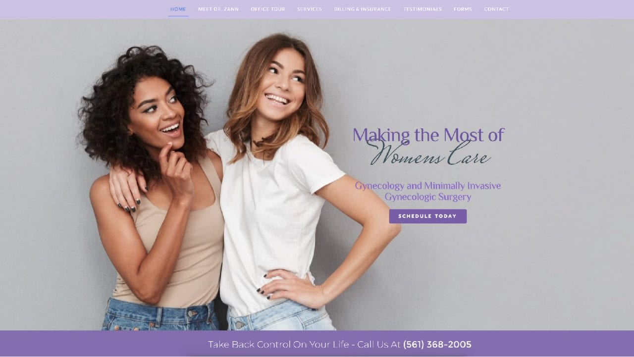
Mixing Bold and Handwriting
While this website design has asymmetrical components, the viewer is immediately attracted to the bold tagline and the hand-written script that further supports the tagline.
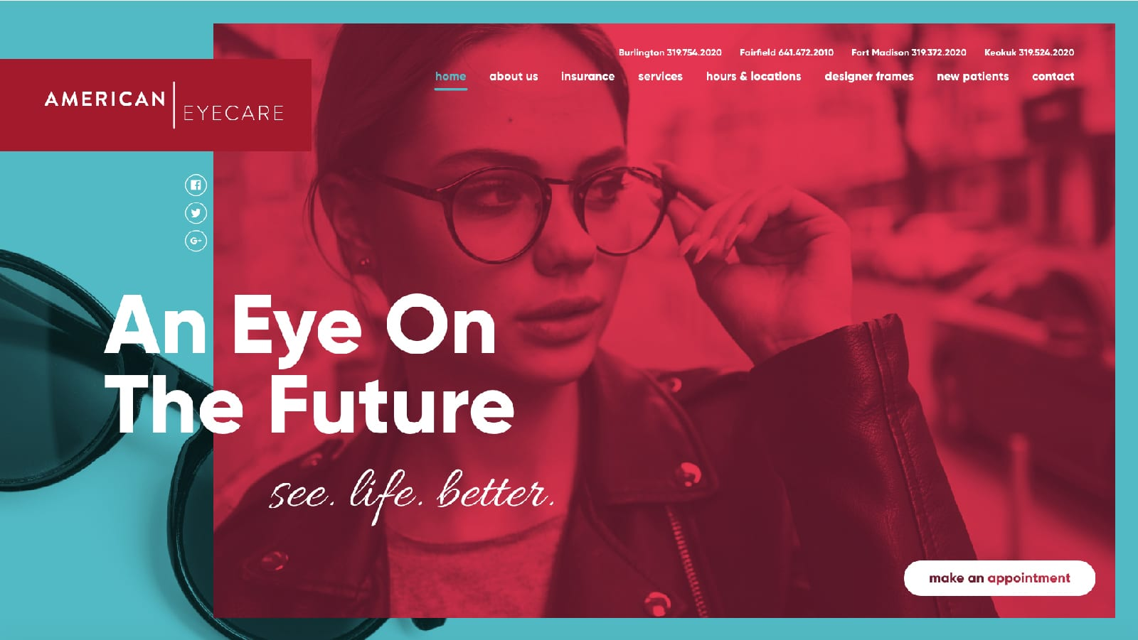
Pairing Bold and Slim Weights
There are many areas of text noted on this website. However, the designer focuses on the boldness of specific parts of the tagline and leaves less important phrases in a more thin, incognito view.

Best Dental Website Design Company
Color Pairing With Font Types
Though designers may choose the same typeface, one may still differentiate text by the use of color. This example shows a primarily pink color scheme, but the color blue allows a good distinction between the two fonts.
Dental and Medical Font Selection
The choice of type depends mainly on the particular medical practice. Surgeons, medical specialists, and primary care physicians may prefer a more formal type for their websites. Dentists may choose a type that is less formal when their practices serve both adults and children.
The most important factor is the reaction of the target audience. For example, choosing a modern thin sans-serif font is a poor choice for highly specialized practices.
Site headlines can be serif type while content beneath the headline is presented in sans serif type. This also applies to medical product websites. For less serious practices, you can even choose three font types. But that should be an occasional choice.
New vs. Existing Medical Sites
Another issue for consideration is whether the practice is new or is an existing one with a long-standing clientele. First impressions are lasting impressions even for startup medical, dental, and medical professionals.
Choose content that maintains a focus on professionalism and type that offers a fresh image for the announcement of a new medical practice. Existing medical sites may want to use two sets of types for additions to their services to ensure the information is not ignored.
Learn Typography Early
Learning the variances typography styles early on is a valuable tool in understanding medical and dental website design and effective website content.
It may be a good idea for medical and dental students to present their student documentation in the suggested serif and sans serif type styles to learn how to create stylish medical and dental documents and text that looks professional.
Demographics
Formal types are used most often in larger urban areas to attract a more diverse group of prospective patients and medical clients. In rural areas, less formal types suit the needs of this demographic region.
Examples
Below you will see a good list of font pairing that works well for medical or dental practices.
Tools
There are a few great tools that are very helpful for selecting fonts.
Fount
Fount is a Chrome extension that helps you find what font sets is used in a website you look at. This makes everyone’s life easier. You see a website that gives you the impression you like to leave, you simply click on the icon and click on any text and the app gives you a full set of specs about the font.
Font Joy
This website offers a wonderful tool for pairing up to three fonts. You can choose a starting font and it will give you a paring suggestion based on your criteria. You can find fontjoy.com here.
Canva
Canva.com which is a design app, offers a very practical tool to find pairs of fonts that work well together.
Conclusion
There are literally thousands of fonts out there. But a medical or dental website does not need to be fancy. Sometimes being familiar and safe works best. When you have doubts, always go with the more traditional option. If you have suggestions for good font pairs for healthcare websites you have designed, send them to us, and we will add them here, mentioning your name.


